est fonts for web design are not simply the fonts that look attractive on a homepage. The right choice improves readability, strengthens hierarchy, supports brand personality, and helps users move through a website with less friction.
In practice, the best website fonts are the ones that stay clear across headings, body text, buttons, forms, and mobile screens.
Strong website typography also helps a website feel more polished, easier to scan, and more trustworthy.
For businesses in the UAE, this matters even more. Mobile readability, clean UI typography, and consistent bilingual presentation can directly affect how users read, trust, and act.
For expert guidance on website typography, font pairing, and choosing the best fonts for web design, Message Lucidly on WhatsApp.
Best Fonts for Web Design: What Actually Makes a Font Good for Websites
When people search for best fonts for web design, they often want quick names. But the better answer starts with what makes a font work well on a real website.
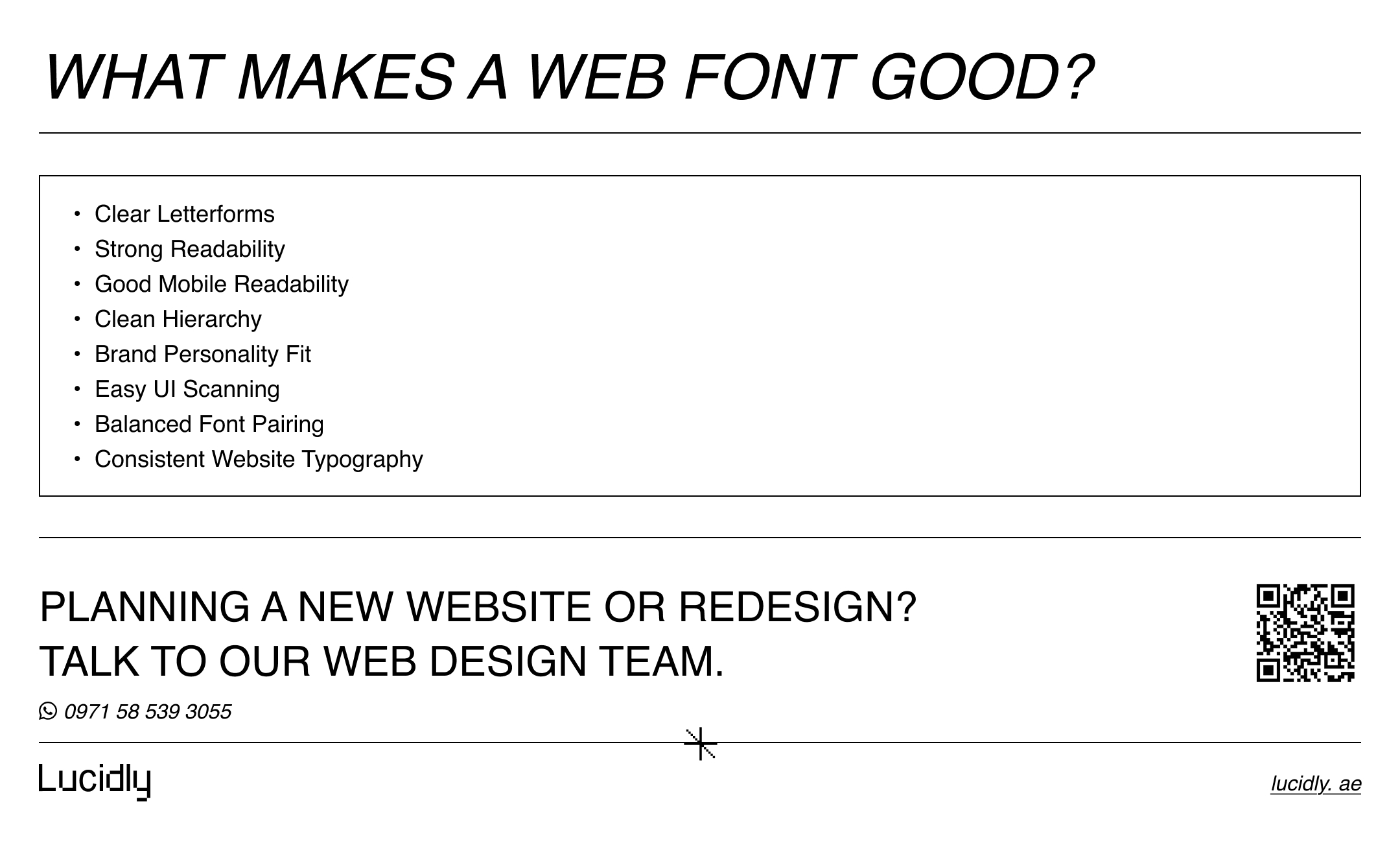
A good web font should not only look good. It should also support readability, scanning, consistency, and usability across different screen sizes.
The Core Traits of the Best Website Fonts
The best website fonts usually have a few practical qualities:
clear letterforms.
easy reading at small sizes.
enough font weights for hierarchy.
strong appearance on mobile screens.
clean rendering in menus, buttons, and body text.
a style that fits the brand without hurting clarity.
Why Web Design Fonts Should Be Judged by Usability, Not Style Alone
Some web design fonts look impressive in a mockup but become tiring inside real pages.
This usually happens when the font is:
too decorative for long text.
too thin for mobile screens.
too narrow for easy scanning.
too inconsistent across headings and body copy.
That is why the best fonts for websites are not always the most expressive ones. They are the ones that help users read comfortably and move through the page with less effort.
How to Choose Fonts for a Website Without Hurting Readability
If you are asking, How do I choose fonts for a website?, start with function before style.
Your font should match the content, the interface, and the way users actually browse the site.
Start With Readability Before Brand Personality
Brand personality matters, but readability comes first.
A font should feel aligned with the business while still remaining easy to read in:
body text.
service sections.
navigation menus.
forms.
product details.
calls to action.
A stylish font that weakens reading is not a strong website choice.
Match the Font Style to the Page Type
Different pages often need different typography priorities.
Blogs and Long-Form Content
Longer content usually benefits from fonts that feel calm and readable over many paragraphs.
Landing Pages
Landing pages can use more personality in headings, but supporting text still needs strong readability.
Ecommerce Pages
Product names, prices, filters, and buttons need efficient UI typography that supports fast scanning.
Service Pages
Service websites need typography that feels clear, credible, and structured.
Check Mobile Readability Before Final Approval
For businesses in the UAE, mobile readability should be treated as a core test, not a final afterthought.
Before choosing a font, check:
how it looks on smaller screens.
whether paragraph text feels cramped.
whether buttons stay clear.
whether headings remain easy to scan.
whether light weights become too faint.
Typography choices also become easier when the wider design direction is clear, especially when comparing custom website design vs templates and deciding which setup better supports your brand.
Best Fonts for Websites: Practical Font Categories That Usually Work
A practical article about best fonts for websites should not just list random names. It should explain which categories usually work and why.
Sans-Serif Fonts for Modern Websites
Sans-serif fonts are often the safest option for fonts for modern websites.
They usually work well for:
business websites.
agency websites.
service pages.
SaaS websites.
ecommerce layouts.
modern landing pages.
Common strong choices include:
Inter.
Roboto.
Open Sans.
Source Sans 3.
Noto Sans.
These often rank among the best website fonts because they support readability, clean hierarchy, and strong interface use.
Serif Fonts That Still Work Well on the Web
Serif fonts can also work well online when chosen carefully.
They are often suitable for:
editorial websites.
article-heavy websites.
premium brands.
professional service brands.
content-led pages.
Examples include:
Merriweather.
Lora.
Source Serif.
Noto Serif.
A serif font can be one of the best fonts for web design if it stays comfortable in real reading conditions.
Variable Fonts and Why They Matter in Website Typography
Variable fonts are useful because they allow more flexibility within one font family.
This can help with:
smoother hierarchy.
fewer separate font files.
cleaner typography systems.
more flexible responsive design.
For many websites, this makes variable fonts a practical option in modern website typography.
Website Font Pairing: How to Combine Fonts Without Making the Design Messy
Website font pairing can strengthen a website when done with restraint.
The goal is not to use more fonts. The goal is to create better hierarchy and contrast without making the design feel inconsistent.
The Safest Way to Pair Headline and Body Fonts
A simple pairing system often works best:
one font for headings.
one font for body text.
This keeps the typography system easier to manage and easier to read.
Pair Contrast, Not Conflict
Strong font pairing usually means the fonts feel different enough to create hierarchy, but not so different that they clash.
Good examples of pairing logic include:
expressive serif heading + neutral sans-serif body.
modern sans-serif heading + softer secondary text font.
strong headline font + highly readable body font.
Common Website Font Pairing Mistakes
Poor website font pairing often happens when the design uses:
two decorative fonts together.
weak contrast between heading and body fonts.
too many font styles.
too many font weights.
body fonts with weak readability.
combinations that collapse on mobile.
How Many Fonts Should a Website Use?
This is one of the most useful practical questions: How many fonts should a website use?
For most websites, one or two fonts are enough.
One-Font Systems
A one-font system can work very well when the font family includes enough weights and styles.
This approach often helps with:
stronger consistency.
cleaner interfaces.
easier maintenance.
simpler hierarchy control.
Two-Font Systems
A two-font system is also common and often effective.
Usually this means:
one font for headings.
one font for body content.
This can add personality without creating clutter.
When a Third Font Is Justified
A third font is rarely necessary.
If it is used, it should have a very limited role, such as:
a small accent use.
a special editorial purpose.
a controlled brand expression area.
In most cases, more fonts create more problems than benefits.
Do Fonts Affect Readability and Conversion?
Yes, fonts affect readability, and readability affects how users interact with a website.
A clearer typography system can make a page feel easier to understand, easier to scan, and easier to trust.
Better Readability Supports Better User Decisions
When users can read content easily, they are more likely to:
understand the offer faster.
stay on the page longer.
scan headings more effectively.
notice calls to action.
move through the page with less friction.
Poor Typography Creates Friction
Weak website typography can hurt user experience in quiet but important ways.
Common problems include:
dense-looking paragraphs.
unclear heading structure.
weak contrast between content levels.
hard-to-read mobile text.
inconsistent UI text styles.
To see how clearer typography, stronger structure, and better user flow can influence business results, it also helps to explore UI/UX Design in Dubai: How Better Website Design Improves Leads and Sales.
Why UI Typography Matters on Service and Ecommerce Pages
UI typography matters because users do not only read articles. They also read:
menus.
buttons.
forms.
filters.
labels.
product names.
price sections.
When these elements are clear, the website becomes easier to use.
Best Fonts for Web Design in the UAE: What Matters for Local Businesses
Choosing the best fonts for web design in the UAE should reflect how people browse and interact with websites locally.
Mobile-First Browsing in the UAE
Many users first visit websites through their phones.
That makes mobile readability especially important for:
service inquiries.
WhatsApp-first contact journeys.
ecommerce browsing.
quick comparison behavior.
local business discovery.
Bilingual Typography Matters
Many UAE websites need to present both English and Arabic.
This means web typography fonts should support:
visual consistency across both languages.
readable weights in both scripts.
clear spacing.
strong UI clarity.
a cohesive brand tone.
Best Approach for Modern UAE Websites
For many businesses, the safest direction is:
a clean primary font.
strong readability in body text.
limited font pairing.
consistent hierarchy.
mobile-friendly rendering.
balanced Arabic and English presentation where needed.
To explore practical support with typography, usability, and website structure, you can learn more through Lucidly’s web design services.
Technical Website Typography Rules That Improve Performance
Typography decisions affect not only design, but also performance.
A website should not load fonts in a way that creates unnecessary friction.
Use Proper Font-Family Stacks
A good font setup should include sensible fallback choices.
This helps protect readability if the preferred web font does not load as expected.
Use Web Fonts Carefully
Custom web fonts should be used with restraint.
Loading too many files or styles can create unnecessary weight.
Consider Variable Fonts for Cleaner Delivery
Variable fonts may help reduce complexity while still giving the site enough control over hierarchy and style.
Test Text Spacing and Scaling
A font system should still work well when text is:
viewed on mobile.
enlarged.
spaced differently.
used in narrow layouts.
shown inside interface elements.
Common Website Typography Mistakes to Avoid
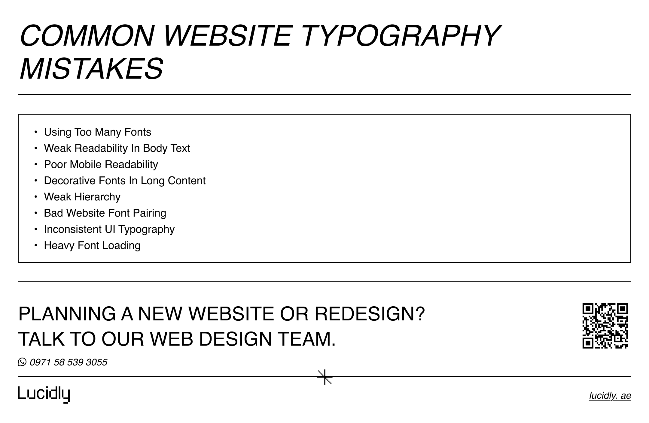
A practical article on best fonts for web design should also explain what to avoid.
Choosing Stylish Fonts That Weaken Readability
A font can look impressive and still be a bad choice for real use.
This often happens when it is:
too decorative.
too thin.
too compressed.
too hard to read in paragraphs.
Using Too Many Fonts
Too many fonts can make the site feel fragmented.
This weakens:
hierarchy.
consistency.
brand clarity.
interface calmness.
Ignoring Hierarchy
Users should be able to tell the difference between:
main headings.
subheadings.
body copy.
supporting labels.
CTA text.
When hierarchy is weak, scanning becomes harder.
Forgetting Mobile Readability
A font that works on desktop may fail on mobile.
Always test for:
size.
spacing.
weight.
clarity.
scanability.
Loading Fonts Without Performance Planning
Typography should support performance, not fight it.
Too many font files can slow down the page and complicate the experience.
Recommended Best Fonts for Web Design by Use Case
A useful article should give readers practical direction, not only theory.
Best Fonts for Websites With Long-Form Content
These often work well for reading-heavy pages:
Merriweather.
Lora.
Inter.
Source Serif.
Best Website Fonts for Service Businesses
These often suit service pages and business websites:
Inter.
Open Sans.
Roboto.
Source Sans 3.
Best Fonts for Modern Websites and Clean UI
These often work well for modern digital brands:
Inter.
Roboto.
Noto Sans.
Source Sans 3.
Best Website Font Pairing Choices for Simple Business Websites
Reliable pairing directions include:
serif heading + sans-serif body.
strong sans-serif heading + neutral sans-serif body.
one versatile font family with multiple weights.
FAQs
What Are the Best Fonts for Web Design?
The best fonts for web design are the fonts that combine readability, hierarchy, brand fit, mobile clarity, and strong usability.
In many cases, clean sans-serif fonts work especially well. Serif fonts can also perform very well when used in the right context.
How Do I Choose Fonts for a Website?
Start with the content and user experience.
Check:
readability
page type
mobile performance
brand personality
heading and body contrast
UI clarity
Then choose fonts that make the website easier to use, not only more visually distinctive.
How Many Fonts Should a Website Use?
Most websites only need:
one font, or
two fonts
More than that is often unnecessary.
Do Fonts Affect Readability and Conversion?
Yes. Fonts affect readability, scanning, trust, and ease of use.
That means typography can influence how confidently users move toward action.
The best fonts for web design are the ones that improve readability, hierarchy, brand personality, and mobile usability. The strongest choice is usually the one that makes a website clearer, easier to scan, and more comfortable to use.
If you need expert help choosing the best fonts for web design, improving readability, and building a cleaner website typography system, Message Lucidly on WhatsApp or use the phone numbers listed on the Contact Us page
References
MDN Web Docs, Web Fonts
Google Fonts, Variable Fonts
