How to plan a website is not about choosing a design first—it’s about making clear decisions before anything is built. Without a plan, websites often grow messy, hard to navigate, and disconnected from real business goals.
This guide walks you through the full planning process, from defining what your business actually needs to mapping user journeys, creating wireframes, and building a clean site architecture.
By the end, you’ll have a practical roadmap that supports growth, usability, and long-term scalability.
Message Lucidly on WhatsApp for a practical website planning review before you design or build anything.
TL;DR — The Website Planning Flow
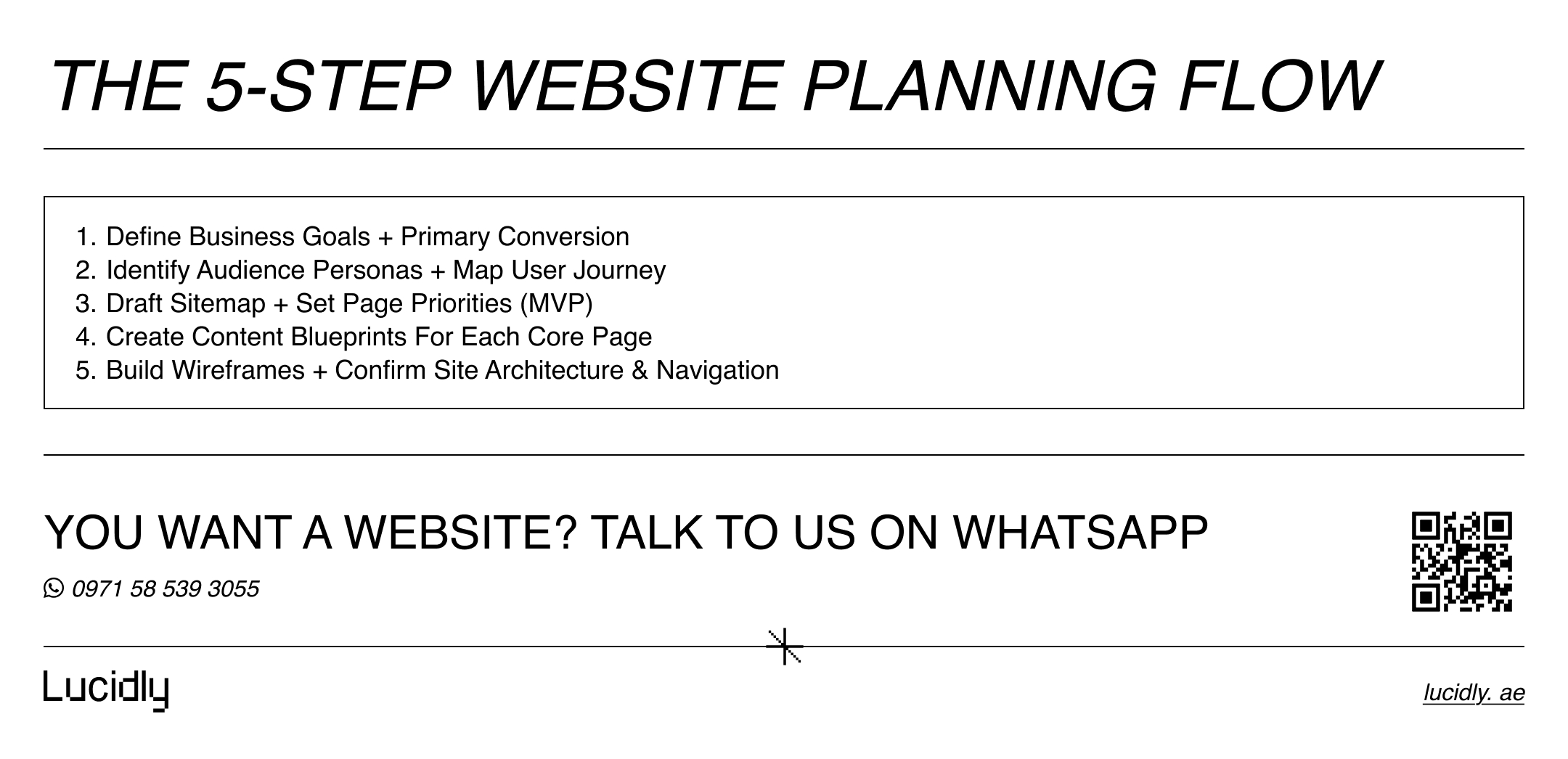
Planning a website becomes much simpler when you think in terms of decisions, not pages. Instead of jumping between design ideas, tools, and features, this flow keeps everything aligned—from business intent to structure.
If you understand these steps, you understand the logic behind how to plan a website properly, without overbuilding or missing critical foundations.
Define clear business goals and the primary action you want users to take.
Understand your audience and map their journey across the site.
Draft a sitemap that lists required pages and priorities.
Create wireframes to organise content and user actions.
Finalise site architecture, navigation, and URL structure before development.
Step 1 — Start With Business Goals (Not Design)
Most websites fail for one simple reason: they were built around pages and aesthetics, not outcomes.
Before you touch layouts, fonts, or templates, define what “success” looks like for the business.
When you do this first, every later decision—sitemap, wireframes, and site architecture—has a purpose.
This is the fastest way to keep the project focused and avoid building a site that looks good but doesn’t convert.
Choose one primary conversion
A website can support multiple actions, but it needs one main action per page (and usually one main action for the site overall). Otherwise, visitors hesitate, bounce, or take the wrong path.
Start by picking the single conversion that matters most right now, then design the site flow around it.
Here are common primary conversions for UAE businesses:
Book a consultation call.
Request a quote (RFQ) or proposal.
WhatsApp message (especially for services).
Buy a product or place an order.
Submit a lead form (callback / enquiry).
Visit a location (maps + directions).
Define KPIs that prove the site is working
Goals are only useful when you can measure them. KPIs keep the team honest and prevent endless subjective debates like “make it more premium.”
Choose a small set of metrics that directly reflect business value, then connect each KPI to a page and a user action.
To make this practical, define KPIs like:
Leads per week (forms, calls, WhatsApp clicks).
Conversion rate per key page (service pages, landing pages, contact page).
Call-to-action click rate (buttons, phone tap, WhatsApp tap).
Qualified enquiries (not just volume).
Booking completion rate (if you use a calendar/booking tool).
Deliverable for this step: a simple one-page “Goals & KPIs sheet” that lists your primary conversion, secondary conversions, and the 3–6 KPIs you’ll track after launch.
This keeps how to plan a website grounded in real outcomes—not opinions.
Ready to Build a High-Performance Website?
Turn strategy into results with Lucidly’s custom web development solutions — built for speed, SEO, and business growth.
👉 Book Your Web Development Consultation
Step 2 — Know Your Audience and Their Journey
A strong website plan is built around people, not assumptions. If you don’t clearly understand who the site is for and why they’re visiting, even a well-designed structure will underperform.
This step focuses on turning vague ideas like “potential customers” into concrete user profiles and mapping how they move from first visit to conversion.
It’s a critical layer in how to plan a website that actually feels intuitive to real users.
Build a small set of realistic personas
You don’t need complex documents or fictional backstories. What matters is clarity. For most business websites, two or three personas are enough to guide structure, content, and prioritisation. Each persona should answer the questions that affect decisions on the page.
For each persona, define:
Their role or situation (buyer, decision-maker, researcher, urgent lead).
The problem they’re trying to solve.
The questions they need answered before trusting you.
The action they are most likely to take on the site.
Map the user journey across the site
Once personas are clear, map their journey from entry to action. This helps you decide what content belongs where and prevents forcing users to “figure it out” themselves.
A simple journey map keeps your site focused and reduces friction.
A practical user journey usually follows three stages:
Discover: the user lands on the site and tries to understand what you do and whether it’s relevant.
Compare: the user evaluates services, proof, and differences between options.
Decide: the user looks for reassurance, clarity, and an easy way to take action.
Each stage should be supported by the right pages, messaging, and calls to action—not everything on one page, and not the same message everywhere.
Deliverable for this step: a one-page journey map showing which pages support each stage of the user’s decision process.
This keeps how to plan a website grounded in user behaviour, not guesswork.
Step 3 — Create the Sitemap Before Wireframes
Before you sketch layouts or discuss page sections, you need to agree on what actually exists on the site. A sitemap is not a technical document—it’s a strategic one. It defines the scope of the website, clarifies priorities, and prevents pages from being added randomly later. This step is essential if you want a site that feels intentional and easy to navigate, not stitched together over time.
Define the core pages your website needs
Most business websites don’t need dozens of pages to be effective. They need the right pages, each with a clear role in the user journey. Start by listing only what is necessary to support discovery, comparison, and decision-making.
In most cases, this includes:
Homepage that explains what you do and who it’s for
About page that builds trust and credibility
Services overview page
Individual service pages (one per core service)
Case studies or portfolio (if proof matters)
Blog or resources section (optional but valuable)
Contact page with clear action paths
Legal pages (privacy policy, terms), if required
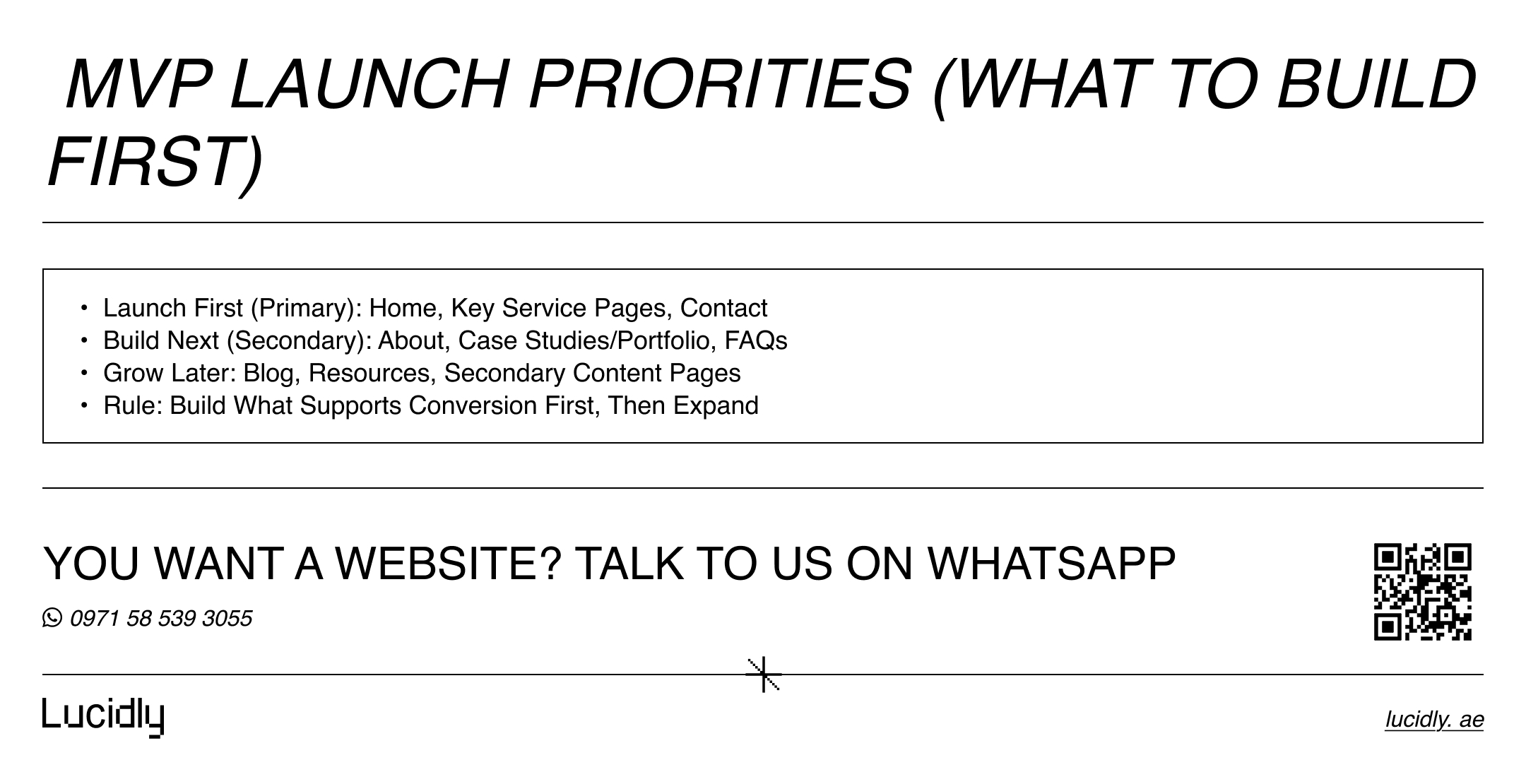
Prioritise pages instead of treating them equally
Not all pages are equally important at launch. Some pages are critical for conversions, while others can evolve over time. Assigning priorities helps you plan realistically and avoid delays caused by trying to build everything at once.
A simple prioritisation approach:
Primary pages: homepage, key service pages, contact page
Secondary pages: about, case studies, FAQs
Later additions: blog expansion, resources, secondary content
This clarity helps align teams and keeps how to plan a website focused on outcomes, not page volume.
Deliverable for this step: a first-version sitemap that lists all pages, grouped by section, with a clear priority level for each page.
Step 4 — Plan Each Page’s Content Before Layout
Once the sitemap is clear, the next mistake to avoid is jumping straight into layout decisions. At this stage, your job is not to decide how pages look, but what each page needs to say and achieve.
Planning content first ensures that wireframes serve the message, not the other way around. This is a key discipline in how to plan a website that communicates clearly and converts consistently.
Define the core message of each page
Every page should have a single, dominant purpose. If you can’t explain what a page is meant to do in one sentence, it’s not ready to be designed. This clarity prevents bloated pages and helps users understand where they are and what to do next.
For each page, define:
The primary question the page answers.
The main value proposition (why this page exists).
The action the user should take after reading.
Create a simple content blueprint per page
Instead of writing full copy immediately, outline the structure of the content. This keeps discussions focused and avoids rewriting later. A content blueprint also makes it easier to spot gaps or unnecessary sections before design starts.
A practical page blueprint usually includes:
Clear headline that sets context.
Short introduction that frames the problem.
Key benefits or solutions (not features).
Proof elements (testimonials, logos, case examples).
Call to action that matches the user’s intent.
Supporting content such as FAQs or reassurance notes.

Cut anything that doesn’t support a decision
Not every idea deserves a section. If a paragraph doesn’t help the user understand, compare, or decide, it weakens the page. Planning content early makes it easier to remove noise before it becomes expensive to fix.
Deliverable for this step: a content outline for every core page, written as bullet points or short notes, ready to be turned into wireframes and copy.
Step 5 — Wireframes That Support Conversions
With content planned, wireframes become a tool for clarity—not decoration.
Their purpose is to organise information, guide attention, and support action before any visual styling is applied.
When done well, wireframes reduce confusion, speed up design decisions, and keep everyone aligned on what matters most.
Focus on structure, not visuals
Wireframes should stay intentionally simple. At this stage, colours, fonts, and imagery only distract from the real questions: where does content go, and what does the user do next? A clean structure makes usability issues obvious early.
Strong wireframes usually show:
Page hierarchy and section order.
Placement of headlines, text blocks, and CTAs.
How proof and supporting content fit into the flow.
Clear separation between primary and secondary actions.
Design around one primary action per page
Each page should guide users toward a single main action. Secondary options can exist, but they should never compete with the primary goal. This focus improves usability and prevents hesitation.
For example:
Homepage → explore services or book a call.
Service page → request a quote or contact sales.
Content page → move to a relevant service or next step.
Create repeatable templates, not one-off pages
Instead of designing every page from scratch, plan a small set of wireframe templates. This improves consistency and makes the site easier to expand later without redesigning everything.
Common wireframe templates include:
Homepage.
Service page.
Case study or portfolio page.
Contact or lead-capture page.
Deliverable for this step: a small set of approved wireframes for key page types, ready to move into visual design and development.
Step 6 — Build a Site Architecture That Scales
Once wireframes are defined, it’s time to step back and look at the website as a system. Site architecture is about how pages relate to each other, how users move between them, and how easily the structure can grow over time. A strong architecture makes the site intuitive today and flexible tomorrow, which is a core principle in how to plan a website for long-term use.
Keep the hierarchy shallow and logical
Users should never feel lost or forced to dig through multiple layers to find important information.
A shallow structure improves clarity and reduces friction, especially on mobile. In practice, most key pages should be reachable within two or three clicks from the homepage.
A clear hierarchy usually looks like:
Homepage as the central hub.
Primary sections (Services, About, Resources) directly beneath it.
Detail pages nested under clear categories.
This structure helps users understand where they are at a glance and makes future expansion easier.
Group content by intent, not by internal teams
One common mistake is organising pages around internal departments instead of user needs. Visitors don’t care how your company is structured—they care about solving their problem. Group pages based on what users are trying to achieve, not how your organisation is divided.
For example:
Services grouped by customer problem or use case
Resources grouped by topic, not format
Case studies grouped by industry or outcome
Plan internal connections between related pages
Architecture isn’t only about hierarchy; it’s also about relationships. Related pages should support each other naturally, helping users move forward without friction.
This means planning connections such as:
Service pages linking to relevant case studies
Content pages pointing to the next logical step
Supporting pages reinforcing core conversion pages
Deliverable for this step: a visual or written site architecture map showing page hierarchy and key internal connections.
Step 7 — Define URL Structure and Navigation Early
With the architecture in place, small structural decisions start to have a big impact. URL structure and navigation labels influence usability, maintenance, and future growth.
Defining them early prevents confusion later and keeps the site consistent as it expands.
Use clean, predictable URL patterns
URLs should be easy to read and easy to scale. Avoid unnecessary parameters, dates, or vague naming. A consistent pattern makes the site easier to manage and understand over time.
Good examples include:
/services/service-name/
/case-studies/project-name/
/resources/topic-name/
Keep navigation focused and readable
Navigation should guide users, not overwhelm them. Limiting the number of menu items forces prioritisation and improves scanning, especially on smaller screens.
Best practices include:
5–7 main items in the primary menu.
Clear, descriptive labels (avoid clever but unclear names).
Secondary links placed in the footer, not the main menu.
Account for multilingual or regional needs early
If the site will support multiple languages or regions, plan this at the structure level—not as an afterthought. Consistent structures across languages reduce complexity and prevent future rebuilds.
Deliverable for this step: a documented URL pattern and navigation structure agreed on before design and development begin.
Step 8 — Plan Navigation and Internal Flow
Once URLs and page hierarchy are defined, the next layer is how users actually move through the site.
Navigation and internal flow determine whether visitors feel guided or lost. A well-planned flow reduces friction, shortens decision time, and makes the website feel intentional rather than overwhelming.
This step ensures that the structure you planned works in real-world use, not just on paper.
Design navigation around user priorities
Navigation should reflect what users care about most, not everything the business offers. Each menu item should earn its place by helping users move closer to their goal. If a link doesn’t support a common task or decision, it probably belongs elsewhere.
Effective navigation usually:
Highlights core services or offerings.
Makes the primary action easy to find from anywhere.
Uses familiar, descriptive labels.
Avoids deep dropdowns unless absolutely necessary.
Deliverable for this step: a simple internal flow plan showing how users move from entry pages to conversion pages.
Step 9 — Website Planning Checklist (Pre-Build)
Before moving into design and development, it’s worth pausing to confirm that the foundation is complete. A short checklist helps catch gaps early and keeps the project grounded in decisions rather than assumptions. This final review is often what separates smooth launches from stressful rebuilds.
Final pre-build checklist
Use this checklist to validate your planning work:
Business goals and primary conversion clearly defined.
KPIs agreed and tied to specific pages.
Audience personas and user journeys documented
Sitemap approved with page priorities.
Content outlines completed for all core pages.
Wireframes approved for key page templates.
Site architecture and internal flow mapped.
URL structure and navigation finalised.
Tracking requirements identified (forms, calls, messages).
Deliverable for this step: a single planning document that can be handed to designers, developers, and stakeholders without further explanation.
A successful website is rarely the result of luck or visual flair alone. It works because the thinking behind it is clear.
FAQ
What is the first step in planning a website?
Start by defining clear business goals and the primary action you want users to take (booking, enquiry, WhatsApp, purchase). Without this, design decisions lack direction.
Do I need wireframes before visual design?
Yes. Wireframes help organise content, user flow, and calls to action before colours and visuals, reducing rework and improving usability.
What is the difference between a sitemap and site architecture?
A sitemap lists the pages your site needs and their priority, while site architecture defines how those pages are structured, connected, and navigated by users and search engines.
A successful website is rarely the result of luck or visual flair alone. It works because the thinking behind it is clear.
When you plan goals, users, content, structure, and flow before design begins, the site becomes easier to build, easier to use, and easier to grow. If you want a site that performs consistently—not just at launch—planning is not an extra step. It is the work.
Let’s Build Your Next Website — The Right Way
Whether you need a new website, redesign, or eCommerce platform, Lucidly creates responsive, SEO-ready websites that drive real results.
Contact us for a website planning review—message Lucidly on WhatsApp and we’ll identify what’s missing before you build.
References
Google Search Central — Creating Helpful, Reliable, People-First Content
Nielsen Norman Group — User Journey Mapping: A UX Best Practice
Smashing Magazine — Website Planning: From Goals to Information Architecture
