Launching an online store is easy. Building a shopping experience people trust, understand quickly, and complete on mobile—is the hard part.
In the UAE, that challenge is sharper: bilingual browsing (Arabic/English), high mobile share, delivery expectations by city, and payment preferences that can change confidence at the last step.
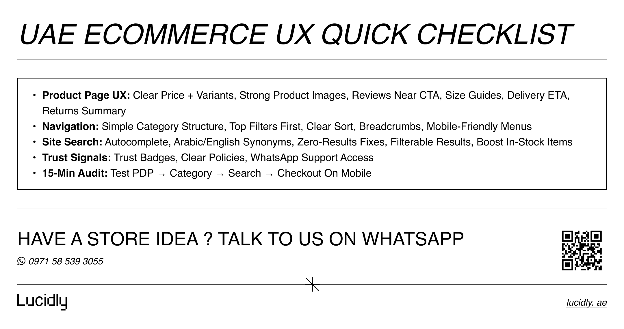
This UAE ecommerce ux guide gives you a product page structure, a navigation checklist, and site search fixes to boost intent. Use it to plan, audit, or align your team before a redesign.
Want a faster, conversion-ready UAE store with stronger ecommerce ux? message Lucidly on WhatsApp for a quick UX checklist review.
UAE Ecommerce UX Basics: What’s Different Here
Before we talk layouts and buttons, anchor on the real context. Great ecommerce ux starts with how people actually shop, not how teams wish they shopped.
First, mobile rules. If your interface needs precise taps, long forms, or tiny filters, conversion will suffer.
Second, bilingual behavior is real. Shoppers may browse in English, search in Arabic, or switch mid-journey. If the experience breaks when language changes, trust drops—so ecommerce ux must be language-safe.
Third, shipping is part of UX. Delivery cost, delivery ETA, and “where do you deliver?” questions appear earlier in the funnel than many teams expect.
Finally, payment visibility affects confidence, so show familiar options early.
Product Pages That Convert: A UAE Product Page UX Blueprint
Your product page is where interest becomes intent. A strong product page ux removes doubt, answers the top questions before they’re asked, and keeps the path to “Add to cart” obvious on mobile.
Start with the above-the-fold essentials.
Above-the-fold essentials (mobile-first)
Before the details and tabs, your first screen should support a decision. That means clarity, not clutter.
Clear product title and key variant (size/color) selection
Price clarity (including “from” pricing only when necessary)
High-quality product images with swipeable gallery and zoom
Delivery ETA by location (even a range) and shipping cost hint
Returns summary (one line) and warranty note if relevant
Primary CTA that stays visible (sticky add-to-cart on scroll)
Then, strengthen trust where it matters. In UAE shopping, confidence is built through clarity and proof, not extra design flourishes.
Trust builders that reduce hesitation
Trust needs to appear near the decision, not hidden in the footer. Keep it visible and easy to verify.
Reviews near the buy decision (rating summary + a few recent comments)
Trust badges that are real (secure payments, official warranty, authentic)
Clear policies linked inline: shipping, returns, exchanges
Size guides for apparel and fit-sensitive products (tap once, not buried)
“Ask a question” support path (chat or WhatsApp) for quick reassurance
Next, make the page scannable. Good ecommerce ui design is about hierarchy and predictable patterns—not visual noise.
Content structure that keeps people moving
When content is structured well, shoppers skim confidently instead of hunting for answers.
Short benefits block (3–5 bullets) before deep specs
Specs/ingredients/compatibility in accordion sections
Delivery and returns details in a dedicated, consistent module
Cross-sell that’s relevant (accessories, refills, complementary items)
Finally, connect the product page to measurement. If you can’t see where users drop, you can’t improve ecommerce ux with confidence.
Tracking events to validate product page performance
Treat tracking as part of product UX quality, not a separate “marketing task.”
View item, select variant, add to cart, begin checkout
Scroll depth to see if key modules are below the fold
“Size guide opened” and “policy link clicked” for hesitation signals
Navigation That Reduces Bounce: Category Structure + Filters
Navigation is the silent salesperson. If shoppers can’t locate products fast, they won’t “explore more.” They’ll exit and search elsewhere. Strong ecommerce navigation blends information architecture with ecommerce ux micro-interactions.
Begin with category structure. A great structure mirrors how customers think: by use case, brand, price band, or occasion—depending on the vertical.
Category structure principles (keep it simple)
Structure should reduce decisions, not add them. Keep labels clean and paths predictable.
Limit top-level categories and avoid duplicates
Use predictable naming (avoid internal terms)
Keep subcategories shallow where possible (2–3 levels)
Add “Best sellers” and “New arrivals” as navigation shortcuts
Then, make filtering effortless. Filters should reduce work, not create it. This is where many online store ux audits find the biggest wins.
Filters and sorting that improve discovery
Filters are one of the highest-impact ecommerce design best practices—but only if they’re usable on mobile.
Put the most used filters first (price, size, brand, availability)
Include “Clear all” and show how many filters are active
Use sticky filter access on mobile (one tap to reopen)
Default sorting that matches intent (best selling or relevance)
Show counts for key options when possible
After that, help users stay oriented—small UI cues prevent bounce.
Orientation features that keep shoppers browsing
When people feel lost, they leave. These features keep context and momentum.
Breadcrumbs that reflect the path (Home > Category > Subcategory)
Persistent category title and short description (optional, not fluffy)
Quick view or quick add-to-cart for repeat items
“Recently viewed” to support comparison
Site Search That Converts: Fix Discovery at Scale
Search is the fastest route to purchase for many stores. If your site search is weak, you lose high-intent users. Improving it is one of the most reliable ecommerce design best practices for conversion.
Start with query handling. UAE shoppers may type Arabic, English, transliteration, or misspellings—especially on mobile.
Search basics that unlock immediate gains
A good baseline search prevents “dead ends” and guides shoppers forward.
Autocomplete with popular queries and categories
Synonyms and spelling tolerance (including Arabic variants)
Zero-results page that offers alternatives and top categories
Search within results: filters and sorting available immediately
Next, rank results by intent. The best search isn’t “accurate.” It’s helpful.
Ranking rules to increase add-to-cart
Ranking should reflect buying intent, availability, and confidence signals.
Boost in-stock items over out-of-stock
Prioritize exact matches for SKU/brand queries
Promote high-rating or best-selling products when relevance ties
Display key attributes in results (price, rating, availability)
Finally, measure search quality. If you track only “search used,” you miss the why—and you can’t tune UX.
Metrics that reveal search problems
These metrics show whether search is helping or pushing users out.
Search exit rate (search then leave)
Search refinement rate (multiple searches in a row)
Result click-through rate and add-to-cart after search
Zero-results frequency and top failing queries
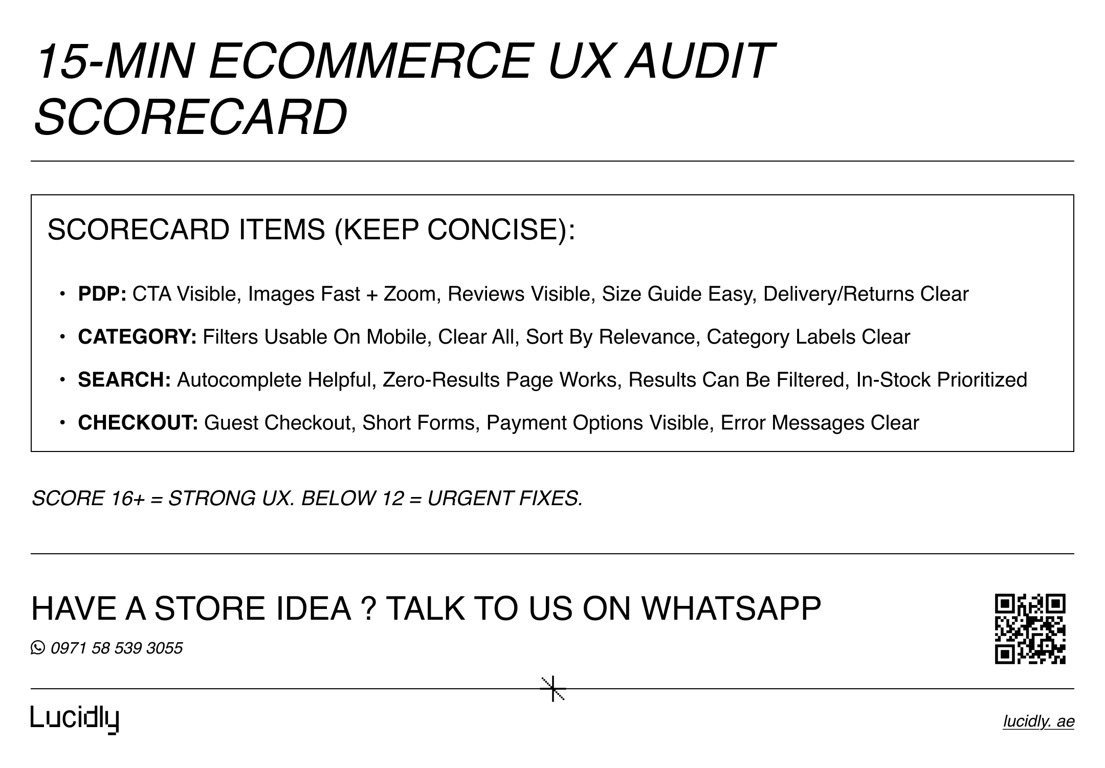
A 15-Minute Ecommerce UX Audit Checklist
If you need a quick review before investing in redesign, run this short checklist. It works as a shopping experience design snapshot you can repeat monthly.
Product page quick scan
Start where intent becomes revenue: the product page.
Do product images load fast and support zoom?
Is the CTA visible and easy to tap on mobile?
Are size guides and returns visible before checkout?
Are reviews placed near the decision point?
Navigation quick scan
Next, test discovery paths like a first-time buyer would.
Can you reach best sellers in 2 taps?
Are filters usable with one hand?
Is category structure consistent across language versions?
Search quick scan
Then, validate high-intent journeys.
Does autocomplete guide users to products or categories?
Are zero results handled with alternatives?
Are search results filterable and sortable?
Tracking quick scan
Finally, confirm the data you’ll use to improve ecommerce ux.
Are add-to-cart, begin checkout, and purchase tracked cleanly?
Can you segment by device and language?
Once tracking is in place, the next step is testing what actually lifts revenue—our Ecommerce CRO (2026): High Impact Tests That Usually Increase Revenue guide covers the experiments worth prioritising first.
Common UAE Ecommerce UX Mistakes (And Fixes)
Even well-built stores in the UAE can leak revenue from small, repeated UX issues—especially on mobile. The good news: these fixes are usually faster and cheaper than a full redesign, and they often lift conversion rate quickly.
Mistake (What happens) | Why it hurts | Fix (What to do) |
Too many apps → slow site | Slower pages increase bounce and reduce checkout completion | Remove unused scripts, consolidate tools, and audit performance monthly |
Weak discovery → shoppers can’t find products | Users abandon when navigation, filters, or search don’t match intent | Improve category structure, strengthen filters, and tune site search around buying intent |
No trust near purchase | Buyers hesitate and abandon at the decision point | Show reviews, delivery timelines, and returns summaries on product pages and checkout |
No abandoned cart recovery | High-intent users leave without a follow-up path | Set up email/SMS flows with clear timing and helpful messages |
No lifecycle setup | Low repeat purchases and weak retention | Connect a CRM and start with welcome, cart, and post-purchase flows |
Does UX Impact Conversion Rate?
Yes—directly. Ecommerce ux influences how quickly shoppers find products, how confident they feel, and how much friction exists at checkout. If you reduce confusion and speed up decisions, conversion rate typically rises. That’s why ecommerce user experience improvements often outperform purely visual refreshes.
Since checkout friction is one of the biggest conversion killers, read Checkout Optimisation: How to Reduce Cart Abandonment and Increase Sales for practical ways to simplify the final steps and recover lost revenue.
For a performance-first approach tailored to UAE shopping behaviors, explore Lucidly’s Ecommerce Solutions in the UAE to turn this checklist into a build plan.
If you're planning the full build, read our guide on Ecommerce Website Development in the UAE: A Complete Guide to Building an Online Store That Sells to see how strategy, UX, platform choice, and local market requirements come together.
FAQ
What makes ecommerce UX convert better?
Conversion improves when the journey is clear: fast discovery, strong trust signals, and a checkout that feels effortless on mobile. Prioritize product images, filters, reviews, and visible delivery/returns info—then measure where users drop and fix the biggest friction points first.
How should product pages be structured?
Use a simple hierarchy: above-the-fold decision essentials (title, price, variants, product images, CTA), then trust (reviews, badges, policies), then details (specs, delivery, returns) in accordion modules. Add size guides where relevant and keep the CTA sticky on mobile.
How do I improve site search for ecommerce?
Start with autocomplete, synonyms, spelling tolerance, and strong zero-results handling. Make results filterable, rank in-stock items higher, and track search exit rate plus zero-results queries. In bilingual contexts, support Arabic/English variants and transliteration patterns.
Does UX impact conversion rate?
Yes. Better ecommerce navigation, clearer product pages, and reliable site search reduce effort and doubt—two main causes of abandonment. When the experience feels predictable and fast, more users reach checkout and complete purchases.
The best ecommerce UX gains don’t require a full redesign—just focused fixes on product pages, navigation, and site search.
Start with one key category, apply this blueprint, and track add-to-cart and checkout completion.
A faster, clearer, more trustworthy experience—especially on mobile and across Arabic/English—will lift conversions and support scalable growth.
Ready to improve ecommerce UX in the UAE? message Lucidly on WhatsApp—or use the numbers on our Contact Us page to book a quick review.
References
Baymard Institute — Product Page UX 2025: Pitfalls & Best Practices. (Baymard Institute)
Google for Developers — Measure ecommerce in GA4 (recommended ecommerce events). (Google for Developers)
Baymard Institute — E-Commerce Product Lists, Filtering & Sorting UX research. (Baymard Institute)
