Cart abandonment is rarely a “traffic problem.” Most ecommerce stores lose sales because the last steps feel slow, confusing, or risky—especially on mobile.
That’s why checkout optimisation is one of the highest-ROI improvements you can make: you increase revenue from the same visitors, without increasing ad spend.
In this guide, you’ll get practical fixes you can apply today, plus ecommerce checkout best practices, UX principles, and test ideas to reduce cart abandonment and increase completed orders.
Want a faster, conversion-ready checkout? Message Lucidly on WhatsApp for a quick checkout UX checklist review.
What is checkout optimisation (and why it increases sales)?
Checkout optimisation means removing friction and uncertainty in the payment journey—so more shoppers finish what they started.
It combines conversion strategy, checkout UX, performance, and trust-building. The best results come from small, measurable improvements: fewer form errors, clearer totals, better payment success rates, and fewer “surprise costs” at the last step.
Think of checkout optimization as a system, not a button color. Your goal is simple: make the checkout feel fast, obvious, and safe—especially on mobile.
When you do, you’ll reduce cart abandonment, improve conversion rate, and often increase AOV (average order value) because shoppers feel confident adding more.
Why shoppers abandon carts (the real reasons)
If you want cart abandonment solutions that work, focus on why people hesitate in the final moments. Most abandonment happens because shoppers hit a trust or effort barrier:
Unexpected shipping costs or fees revealed late
Forced account creation (no guest checkout)
Too many form fields or confusing inputs
Limited or unclear payment options
Weak trust signals during the payment moment
Bad mobile checkout experience
Payment failures, slow loading, errors
Your job is to eliminate doubt and effort. Every extra step, surprise fee, or unclear instruction is a reason to leave.
What’s the best checkout structure? One page checkout vs multi-step
There’s no single “perfect” structure—but there are reliable rules.
One page checkout: when it works best
A one page checkout can increase completions when:
The product is simple (few options, straightforward delivery).
The checkout is short enough to scan without feeling overwhelming.
Mobile users are the majority and typing is minimal.
But one page checkout fails when it becomes a long scroll of forms, choices, and warnings. If shoppers can’t quickly see “what’s next,” they feel stuck.
Multi-step checkout: when it performs better
A multi-step checkout (often 3–4 steps) can improve clarity when:
Shipping, delivery windows, or address logic is complex.
You need to reduce cognitive load by grouping information.
You want better error control per step.
If you choose multi-step, include a progress indicator and allow easy back/edits without resetting everything. A clean multi-step journey is excellent checkout UX.
The rule: fewer steps, more clarity
The best checkout optimisation choice is the structure that minimizes confusion and prevents errors. Many stores do well with 3 steps:
Shipping → Payment → Review, with an optional “Contact” inside Shipping.
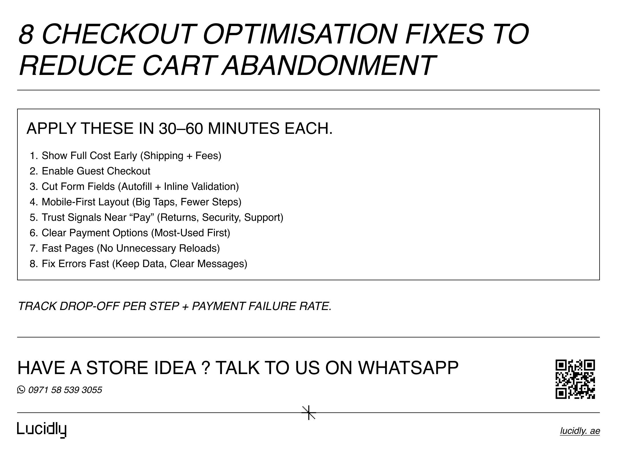
Ecommerce checkout best practices (high-impact fixes)
These ecommerce checkout best practices are proven, practical, and immediately actionable. Apply them in order of impact.
1) Make the total cost obvious early (no surprises)
Unexpected shipping costs are one of the most common triggers of abandonment. Display:
Estimated shipping and delivery timeline before the final step.
Taxes/fees clearly.
Any COD/handling fee transparently (if applicable).
If the final total changes late, shoppers feel tricked—even if the price is fair. This is a core pillar of checkout optimisation.
2) Offer guest checkout (and make it the easy path)
Yes—most stores should offer guest checkout. Account creation adds friction and signals “more work.”
Best practice:
Let shoppers buy as guests.
After purchase, prompt: “Create an account to track orders faster”.
This alone can meaningfully reduce cart abandonment.
3) Reduce form fields and make inputs effortless
The checkout form is not a questionnaire. Reduce required form fields to the essentials:
Name.
Phone/email.
Address (with smart suggestions).
Delivery notes (optional).
Use auto-complete, address lookup where possible, and real-time validation. On mobile, choose the correct keyboard type (email keyboard for email, numeric keypad for phone, etc.). Better mobile checkout always means less typing.
4) Add trust signals where people hesitate
Trust signals work best at the moment of decision. Place them near payment fields and the final CTA:
Secure checkout / encryption note.
Return policy snippet.
Support contact (chat/WhatsApp/email).
Delivery reassurance.
Avoid clutter—but don’t hide reassurance in the footer. This is a subtle but powerful checkout UX upgrade.
5) Improve payment options (and present them clearly)
Your payment layer is part of checkout optimisation. Poor payment choices or unclear UI causes drop-off. Provide relevant payment options such as:
Card payments
Apple Pay / Google Pay (where relevant).
BNPL (if your market expects it).
Cash on Delivery (where relevant).
Then present them simply:
Show the most popular methods first.
Add short microcopy (e.g., “Pay in seconds with Apple Pay”).
Avoid sending users to confusing external steps without explanation.
To choose the right provider and avoid payment-related drop-off, read Payment Gateways in the UAE: How to Choose, Integrate, and Secure Online Payments for a practical guide to gateway selection, integration, and payment security.
6) Make mobile checkout your default design
If mobile is a major traffic source (it usually is), design for thumbs first:
Big CTA button.
Sticky order summary on mobile (or a clear expandable summary).
Minimal scrolling.
Instant feedback when fields are valid/invalid.
Treat mobile checkout as the primary journey—not a simplified version of desktop.
7) Handle errors like a conversion feature, not a bug
Shoppers abandon when they feel something “broke.” Fix this with:
Inline field errors (not at the top of the page).
Clear messages that explain how to fix the issue.
Preserved inputs (never erase fields after an error).
Retry logic for payment errors with guidance.
Error handling is often the cheapest way to reduce cart abandonment.
8) Keep the checkout focused (remove distractions)
Checkout is not where you push blog posts, category links, or unrelated upsells. Remove distractions:
Minimal navigation.
No pop-ups.
Optional coupon entry (not the main focus).
If you want upsells, use cart-level suggestions or post-purchase offers.
If you want these 8 checkout changes implemented in your store (not just discussed), explore Lucidly’s Ecommerce Solutions in the UAE to turn them into a clear build plan.
If you’re building or upgrading your store from the ground up, read Ecommerce Website Development in the UAE: A Complete Guide to Building an Online Store That Sells for a broader view of the platform, UX, payments, and operational setup needed for long-term growth.
Checkout UX that reduces hesitation
Use these UX principles:
Clear headings per section (Shipping, Payment, Review).
A visible progress indicator (multi-step).
An order summary that’s easy to view and edit.
Clear final CTA text (e.g., “Place Order”).
Simple language and consistent spacing.
Even small improvements in checkout UX often outperform bigger redesigns elsewhere.
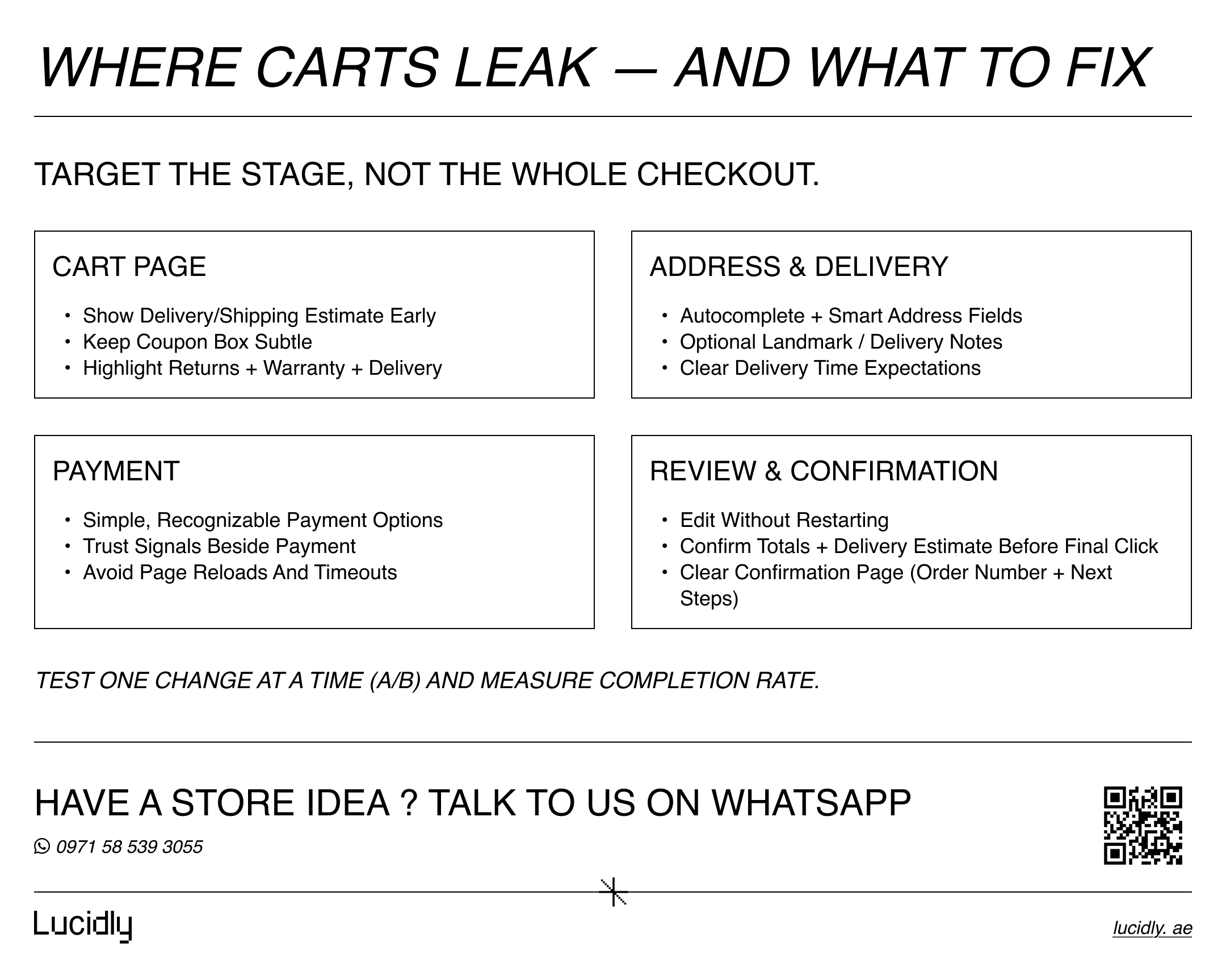
Cart abandonment solutions by checkout stage
Different stages leak for different reasons. Use this mini playbook to apply targeted fixes.
Cart page
This is where shoppers decide whether the total feels worth it. Reduce doubt early and prevent “discount hunting” behaviors.
Show shipping estimator early (or delivery estimate).
Keep coupon input subtle (coupon boxes can trigger “I should leave and find a discount”).
Show trust: returns, warranty, delivery highlights.
Address & delivery
Friction here is usually typing, confusion, or unclear delivery expectations. Make address entry fast and set the right expectations.
Enable auto-complete.
Support delivery notes and landmark info (optional).
Display delivery time expectations clearly.
Payment
This is the highest-trust moment in the funnel. Keep it familiar, fast, and reassuring—especially on mobile.
Keep payment options simple and recognizable.
Show trust signals beside the payment section.
Reduce friction: avoid unnecessary page reloads.
Review & confirmation
Shoppers abandon when edits feel risky or totals change at the end. Make review simple, editable, and confidence-building.
Let users edit shipping or payment without restarting.
Confirm totals and delivery date/estimate before final click.
Make confirmation page clear and reassuring (order number, next steps).
This stage-based approach is how checkout optimisation becomes measurable and repeatable.
A/B tests to optimise checkout (quick wins)
Don’t guess. Run simple A/B tests tied to a clear metric (completion rate, step drop-off, payment success). Here are high-impact tests to optimise checkout:
One page checkout vs multi-step
Measure completion rate and time-to-complete, especially on mobile.Guest checkout prominence
Test guest checkout as default vs secondary option.Shipping cost visibility
Show estimated shipping earlier vs later—watch abandonment at checkout start.CTA copy and placement
“Place Order” vs “Pay Now” vs “Complete Purchase” can change confidence.Trust signals placement
Near payment fields vs footer.Form field reduction
Remove optional fields; measure error rate and completion.Payment options order
Place most-used methods first; reduce scrolling and confusion.Sticky order summary on mobile
Test expandable summary vs static block.
This is where checkout optimisation turns into continuous growth.
If you want to go beyond checkout fixes and prioritise the experiments most likely to grow revenue, read Ecommerce CRO (2026): High Impact Tests That Usually Increase Revenue.
How to measure checkout optimisation (so you know what worked)
Track improvements with the right metrics:
Cart → Checkout start rate.
Checkout completion rate (overall).
Drop-off per step (if multi-step).
Form error rate (field-level).
Payment failure rate (authorization/declines/timeouts).
Mobile vs desktop conversion.
Time to complete checkout.
When you pair these metrics with tests, you’ll reduce cart abandonment reliably instead of relying on opinions.
FAQ
Why do shoppers abandon carts?
Most shoppers abandon because of unexpected shipping costs, forced account creation, too many form fields, weak trust signals, confusing payment steps, or poor mobile checkout. Fixes that improve clarity and reduce effort are the fastest way to improve completion.
Should I offer guest checkout?
In most cases, yes. Guest checkout reduces friction and increases completions—especially for first-time buyers. You can still encourage account creation after purchase to support order tracking and future re-orders.
What’s the best checkout structure?
The best structure depends on complexity. A clean one page checkout can work for simple purchases, while multi-step can improve clarity for complex shipping or delivery flows. The best choice is the one that reduces errors and makes the next step obvious—strong checkout UX wins.
How many steps should checkout have?
Many stores perform well with 3–4 steps. Fewer steps can help, but only if the checkout remains clear and fast. If reducing steps makes the page overwhelming, you’ll lose conversions. The goal of checkout optimisation is to remove friction—not to force a single layout.
Checkout optimisation isn’t a cosmetic tweak — it’s one of the fastest ways to reduce cart abandonment and increase sales from the traffic you already have.
Remove surprise shipping costs, enable guest checkout, cut unnecessary form fields, strengthen trust signals, and make mobile checkout effortless. Keep testing (including one page checkout) and refining your checkout UX — the gains add up quickly.
Ready to improve checkout optimisation and reduce cart abandonment? Message Lucidly on WhatsApp—or use the numbers on our Contact Us page to book a quick checkout review.
References
Baymard Institute — Cart & Checkout Usability Research (Baymard Institute).
Baymard Institute — Cart Abandonment Rate Statistics (Baymard Institute).
Shopify (Enterprise) — How to Reduce Shopping Cart Abandonment (2025) (Shopify).
Google for Developers — Google Pay UX Best Practices (minimal clicks, placement, guest checkout) (Google for Developers).
Stripe — Mobile checkout UI: Best practices (stripe.com).
