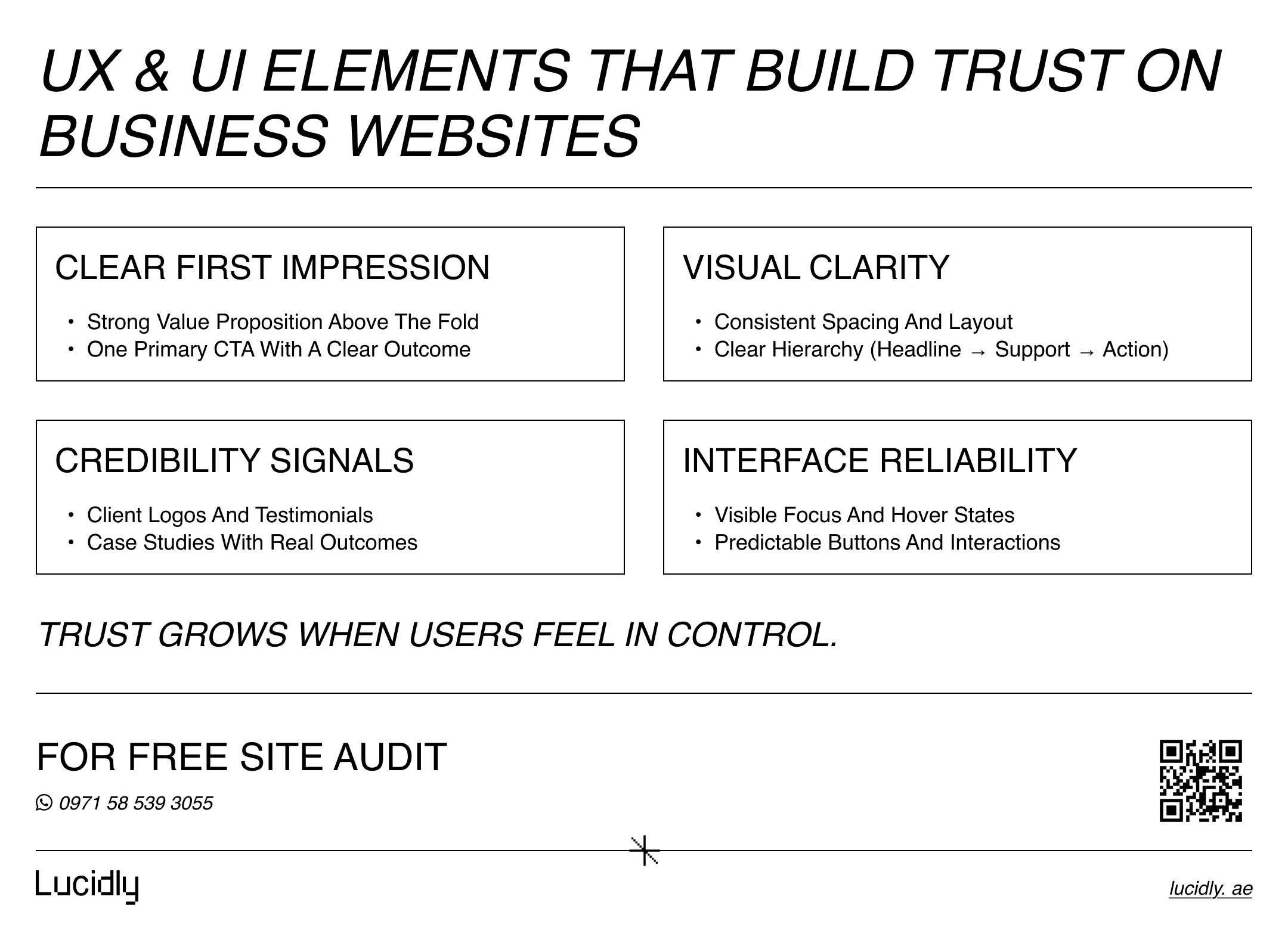
A business website has one job: turn attention into action. That happens when the interface removes doubt, the content matches intent, and the journey feels obvious.
Conversions are a design outcome—built through clarity, trust signals, and low friction.
In this guide, you’ll learn practical UX and UI principles for business websites: what to prioritize above the fold, how to structure information, how to craft CTAs that get clicked, and how to fix leaks in forms, navigation, mobile, and performance—so ux and ui design for websites drives real results.
Message Lucidly on WhatsApp for a clear UX and conversion review—so you can prioritise the fixes that improve usability, trust, and conversions before investing in redesigns or new features.
What “Conversion-Focused” Design Actually Means
Conversion-focused design is not manipulation. It’s alignment: the page clearly communicates value, guides users to the next step, and reduces uncertainty at decision points. When done well, it feels natural—because the page is doing what users hoped it would do.
Before you change colors or layouts, anchor your design around a few conversion realities:
Most users scan before they read.
People hesitate when they feel risk (price, time, credibility).
Confusion kills momentum faster than “bad aesthetics”.
Small UI details (labels, spacing, states) create big UX outcomes.
Strong UX and UI only work when they’re built on solid technical foundations. If you’re still clarifying the development side, this guide on what web development is and how it powers modern business websites explains how structure, performance, and functionality support conversion-focused design.
Define the Primary Action Before You Design Anything
Every page needs a primary action: book a call, request a quote, buy, sign up, or start a trial. Secondary actions are allowed, but they must not compete. Strong ux and ui design for websites starts by choosing what “success” means on each page—then building a path to it.
The Conversion Funnel Starts Above the Fold
Above the fold isn’t about an exact pixel height. It’s the first screen that answers, “Am I in the right place?” If that moment is weak, the rest of your page doesn’t get a chance.
A high-performing hero section usually contains four things, in this order:
A clear value proposition (not a slogan).
A supporting line that proves relevance (who it’s for, what problem it solves).
A primary CTA with an outcome-based label.
A trust cue (logos, review score, certifications, client count).
Write CTA Copy Like a Promise, Not a Button
“Submit” is not a reason to click. A CTA should describe the outcome users want. Replace generic labels with conversion-driven microcopy like:
“Get a Free Quote”.
“Book a 15-Min Call”.
“See Pricing”.
“Get the Audit Plan”.
This is where ux and ui design for websites becomes persuasive without being pushy: you’re making the next step feel safe and specific.
Information Architecture That Reduces Decision Fatigue
If users can’t find what they need quickly, they assume you don’t offer it—or you’re not credible. Information architecture is a conversion lever because it shapes understanding.
Start by mapping your top user intents. Most business websites need clear pathways for:
“I’m evaluating” (services, results, proof, pricing).
“I’m ready” (contact, book, quote, checkout).
“I’m uncertain” (FAQ, comparisons, case studies, guarantees).
Navigation: Fewer Choices, Clearer Labels
A cluttered menu is a silent conversion killer. Keep navigation labels plain and predictable. Avoid vague labels like “Solutions” unless they’re immediately clarified.
A conversion-friendly navigation approach includes:
One primary “money” CTA in the header (Book / Contact / Get Quote).
Logical grouping of services (not 12 menu items).
Descriptive labels users recognize instantly.
A consistent structure across the site.
Done right, ux and ui design for websites feels effortless because users don’t have to “think” to move forward.
Trust Signals: The Missing Layer on Most Business Sites
People rarely convert because they’re fully convinced. They convert when the perceived risk drops below the perceived value. Trust signals are how you reduce that risk.
Add credibility where it matters—near CTAs and decision points—not hidden in a footer.
Some high-impact trust signals include:
Client logos (real, relevant, recognizable).
Review snippets with a name or platform reference.
Case study outcomes (numbers, timeframe, context).
Security or compliance badges (only if accurate).
Clear policies (refunds, cancellation, delivery terms).
Social Proof Works Best When It’s Specific
“Great service!” is weak proof. Better proof answers: what changed?
Use proof that includes details like:
What problem existed.
What was done.
What result occurred.
How long it took.
When proof is specific, ux and ui design for websites doesn’t need hype—the evidence does the work.
Conversion-focused UX starts before visual design. It begins with goals, user journeys, and structure. This guide on how to plan a website from business goals to wireframes and site architecture walks through the strategy behind layouts, navigation, and page flow.
UI Design Principles That Increase Conversions
UI is not “visual decoration.” UI is the interface layer that either supports action—or blocks it. The best UI makes your site feel simpler than it is.
Before you add fancy components, ensure these UI foundations are strong:
Contrast and hierarchy (users see what matters first).
Consistent spacing (the page feels organized, not noisy).
Clear states (hover, active, disabled, error, loading).
Readable typography (users don’t struggle to scan).
Visual Hierarchy: Make the Next Step Obvious
If everything is bold, nothing is. Use size, spacing, and contrast to create a clear path:
One primary CTA style per page.
Secondary actions visually quieter.
Headlines that state outcomes, not features.
Short paragraphs and scannable subheads.
This is a core rule of ux and ui design for websites: the page must guide attention before it asks for action.
UX Patterns That Remove Friction From the Journey
UX is how the experience behaves over time. It’s the flow, not the frame. Most conversion leaks happen mid-journey: unclear steps, unexpected requirements, or forms that feel like punishment.
To reduce friction, focus on:
Predictable page structure.
Clear “what happens next” messaging.
Minimal interruptions (popups, autoplay, clutter).
Consistent components across pages.
Reduce Cognitive Load With Familiar Layouts
Novelty is risky on business websites. Familiar patterns convert because users already understand them. Use proven layouts for:
Service pages (problem → solution → process → proof → CTA).
Pricing pages (tiers → inclusions → FAQ → CTA).
Contact pages (multiple options → fast form → expectations).
When users don’t need to decode the page, ux and ui design for websites becomes a conversion advantage.
Forms That Convert: Labels, Errors, and Microcopy
Forms are where “interest” turns into “lead.” If your form experience is frustrating, you lose the most valuable users—those who were ready.
A conversion-friendly form has three qualities: short, clear, forgiving.
Start by making the form feel easy:
Ask only what you truly need.
Use real labels (not placeholders only).
Show helpful error messages next to the field.
Confirm success with a clear next step.
Error Handling Should Teach, Not Punish
“Invalid input” is lazy. Better microcopy tells users exactly how to fix it:
“Use a work email (name@company.com)”.
“Phone number must include country code”.
“Please enter at least 8 characters”.
These small details are high-impact ux and ui design for websites improvements because they prevent drop-offs at the finish line.
Mobile-First UX: Where Most Business Conversions Are Won or Lost
Mobile isn’t a smaller desktop. It’s a different context: less attention, more distractions, slower networks, and touch interaction. If your mobile UX is weak, your conversion rate optimization efforts will cap out.
Mobile conversion essentials include:
Large touch targets and comfortable spacing.
Sticky CTA for key pages (when appropriate).
Fast load time and stable layout.
Shorter forms and fewer fields.
Click-to-call and tap-friendly contact options.
Mobile experience directly affects conversions. For a deeper look at layouts, breakpoints, and touch-first interaction, this guide on responsive web design and why your website must work on all devices explains how adaptive design improves usability across screens.
Make the Most Important Action Easy With One Thumb
If the primary CTA is hard to reach or easy to miss, users won’t hunt for it. Mobile-friendly ux and ui design for websites brings critical actions closer, clearer, and quicker.
Performance and Page Experience: Speed Is a Conversion Feature
Speed isn’t only technical. It’s emotional. A slow site feels unreliable—and people won’t trust a business that “feels broken.”
Even without obsessing over metrics, aim to reduce friction caused by:
Heavy images and unoptimized media.
Too many scripts and third-party tools.
Layout shifts that move buttons while loading.
Delayed interactivity on mobile.
Core Web Vitals (like LCP, INP, and CLS) are useful signals because they describe how fast, stable, and responsive your site feels. Strong ux and ui design for websites is easier when the experience is smooth.
Testing and Iteration: How to Improve Conversions Without Guessing
Conversion improvements should be measured—not debated. You don’t need a huge CRO team to start; you need a repeatable method.
Begin with a simple optimization loop:
Identify a conversion goal (lead form, booking, purchase).
Find friction points (analytics, recordings, feedback).
Make one meaningful change.
Measure impact (conversion rate, click-through, drop-offs).
What to Track for UX + UI Conversion Performance
Metrics won’t tell you everything, but they reveal where to look. Track:
CTA click rate (especially above the fold).
Form start vs form completion rate.
Scroll depth on long pages.
Mobile vs desktop conversion split.
Drop-off points in multi-step journeys.
This is where ux and ui design for websites becomes scientific: you’re validating what actually helps users move forward.
Ready to Build a High-Performance Website?
Turn strategy into results with Lucidly’s custom web development solutions — built for speed, SEO, and business growth.
👉 Book Your Web Development Consultation
A Practical Checklist for Business Website UX/UI
Here’s a lightweight checklist you can apply during design, QA, or an accessibility audit-style review. Use it to catch conversion blockers early.
Start by reviewing these essentials:
The page has one primary action and one primary CTA style.
The value proposition is clear within the first screen.
Navigation is simple, predictable, and not overloaded.
Trust cues appear near decision points.
Typography is readable and hierarchy is obvious.
Forms use labels, helpful errors, and minimal fields.
Mobile tap targets are comfortable and CTAs are easy to find.
Pages load fast and don’t shift unexpectedly.
Key flows are tested on real devices and browsers.
If you build ux and ui design for websites around this checklist, your conversions improve because your experience becomes easier to complete.

High-converting business websites win by removing doubt and making the next step easy. Treat UX as the journey and UI as the control panel, and your site becomes a growth tool—not a brochure.
Keep improvements focused: sharpen the hero message, simplify navigation, add stronger trust signals, shorten forms, and test keyboard + mobile usability. That’s how ux and ui design for websites becomes a measurable conversion advantage—one practical change at a time.
Contact us — or Message Lucidly on WhatsApp for a clear UX + performance review—so you can prioritize the highest-impact fixes that improve speed, usability, and conversions before investing in redesigns or new features.
References
W3C — WCAG 2 Overview (Web Content Accessibility Guidelines): https://www.w3.org/WAI/standards-guidelines/wcag/ (W3C)
World Wide Web Consortium (W3C). (w3.org)Google Search Central — Understanding Core Web Vitals and Google Search results: https://developers.google.com/search/docs/appearance/core-web-vitals (Google for Developers)
Google for Developers. (developers.google.com)web.dev — Web Vitals (Core Web Vitals explained): https://web.dev/articles/vitals (web.dev)
web.dev (Google). (web.dev)Google — UX Playbook for Lead Gen (PDF): https://services.google.com/fh/files/events/pdf_leadgen_ux_playbook.pdf (Google Services)
Google. (services.google.com)Material Design 3 — Usability Foundations:https://m3.material.io/foundations/usability/overview (Material Design)
Material Design. (m3.material.io)
