 Web accessibility isn’t a “nice-to-have”—it’s a usability foundation. A site can look polished yet fail real users if it can’t be navigated by keyboard, understood by assistive technologies, or read comfortably with low vision or cognitive load.
Accessibility isn’t separate from design; it strengthens ux and ui design for websites, improves clarity, and reduces friction for everyone.
In this guide, you’ll get practical web accessibility basics—WCAG explained for designers, quick UI/UX wins, and a lightweight checklist you can apply immediately.
Message Lucidly on WhatsApp for a clear accessibility and UX review—so you can prioritise the fixes that improve usability, inclusivity, and conversions before investing in redesigns or new features.
What Web Accessibility Means (In Plain English)
Accessibility means your site is usable by people with different abilities, devices, and contexts—whether they browse with a screen reader, rely on keyboard navigation, need stronger color contrast, or benefit from clearer content structure.
Before we go deeper, here are the main realities accessibility design should support:
People who are blind or have low vision using screen reader support.
Users with motor limitations who depend on keyboard accessibility.
People with color blindness who need UI design color contrast requirements met.
Users with hearing loss who need captions and transcripts.
People with cognitive differences who need predictable patterns and readable typography.
Anyone with a temporary limitation (injury, bright sunlight, poor connection, stress).
Accessibility vs Usability vs UX
Accessibility overlaps with usability, but it’s more specific. Usability is about how easy something is for an average user.
Accessibility is about whether more users can operate it at all. Together, they’re what strong ux and ui design for websites is supposed to deliver: clarity, control, and confidence—regardless of ability.
Why Accessibility Matters for Business (And SEO)
Accessibility is often framed as compliance, but its most reliable value is performance: fewer barriers means more completed actions—signups, purchases, form submissions, and contact requests.
To make the business case concrete, here’s what accessible UX typically improves:
Higher conversion rates through clearer flows and fewer dead-ends
Lower bounce rate because users can actually interact with key elements
Stronger trust signals: better structure, better readability, fewer “broken” experiences
Better mobile accessibility through stronger touch targets and spacing
Accessibility and SEO: The Indirect Advantage
Accessibility doesn’t guarantee rankings, but accessible patterns often align with what search engines interpret well.
According to W3C’s guidance on headings, a clear headings hierarchy improves structure and navigation—principles that also reduce ambiguity for both users and machines.
In practice, ux and ui design for websites that supports accessibility tends to produce cleaner information architecture and a more reliable page experience.
A Quick Note on Legal Risk
Depending on your market, accessibility expectations can be enforced through regulations or legal claims (for example, ADA-related cases in the US).
Even if you’re not aiming for strict legal positioning, accessible design is still a smart baseline because it reduces user exclusion and customer loss.
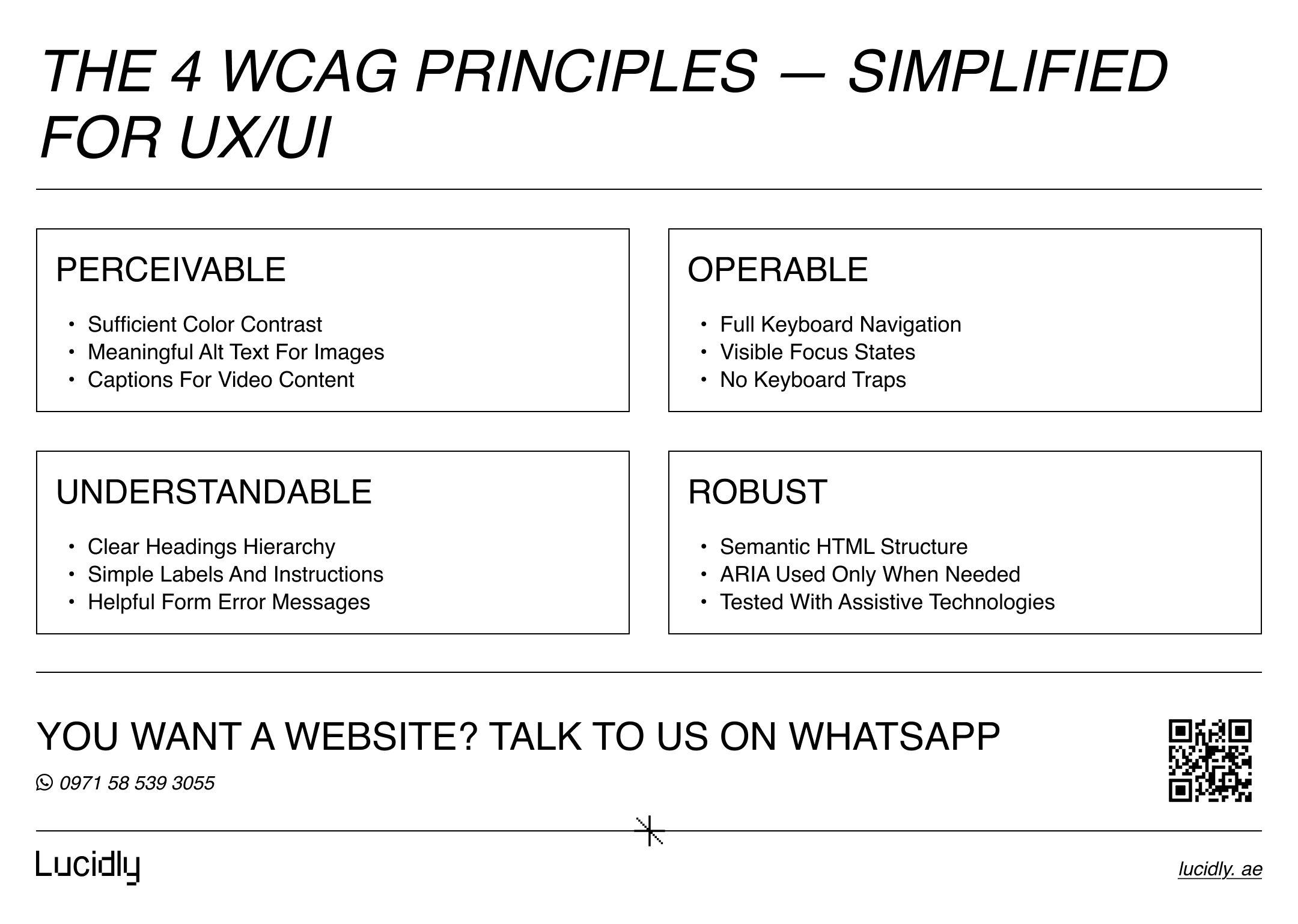
The Four Accessibility Principles (POUR) Without the Jargon
WCAG guidelines are built around four principles: Perceivable, Operable, Understandable, and Robust. Think of these as guardrails for accessible UX/UI design—not abstract theory.
Before you apply them, keep these design-friendly questions in mind:
Can users perceive the content in more than one way?
Can users operate everything without a mouse?
Is the experience understandable and predictable?
Will assistive technologies interpret your UI correctly?
According to W3C’s Web Content Accessibility Guidelines (WCAG), accessible websites rely on clear structure, meaningful labels, and predictable interaction patterns—principles that directly support inclusive and usable UX/UI design.
Perceivable: Users Must Be Able to “Get” the Content
If your UI relies on color alone, tiny text, or images without context, it breaks for many users. Perceivable design covers fundamentals like color contrast, alt attributes, and readable typography.
Operable: Users Must Be Able to Use the Interface
Operable means everything works via keyboard navigation, focus states are visible, and interactions don’t trap users. This also includes tab order, skip link patterns, and avoiding timing-based traps.
Understandable: Users Must Be Able to Follow the Logic
Predictable layouts, clear labels, meaningful error messages, and simple language are part of cognitive accessibility. If users can’t figure out what to do next, it’s not inclusive UX.
Robust: The Experience Must Work Across Technologies
Robust design uses semantic HTML, supports assistive technologies, and avoids “faking” controls with divs. ARIA labels can help, but only when used correctly and sparingly.
UI Quick Wins That Improve Accessibility Immediately
Most accessibility improvements are not dramatic redesigns. They’re smart constraints that make ux and ui design for websites clearer and more reliable. If you only fix a few things this week, start here.
To focus your efforts, these are the highest-impact UI areas:
Color contrast and text legibility.
Visible focus states for keyboard users.
Clear control labels (especially icon-only buttons).
Spacing and touch targets (mobile-first reality).
Consistent component behavior (predictability reduces cognitive load).
Color Contrast: The Fastest Fix With the Highest Impact
Weak contrast is one of the most common web accessibility mistakes to avoid—and one of the easiest to correct. If body text, buttons, or form hints are faint, people with low vision or bright-screen conditions will struggle.
A practical approach that keeps design clean:
Test contrast early in design, not after web development.
Avoid light gray text on white backgrounds for core content.
Ensure button text is readable in all states (default, hover, disabled).
Readable Typography: Accessibility That Also Looks Premium
Readable typography isn’t just bigger font size. It’s spacing, line height, and rhythm. If your paragraphs feel dense, users scan less and abandon sooner.
Use these readability standards as a starting point:
Comfortable line height for long-form content.
Reasonable line length (avoid ultra-wide blocks).
Clear hierarchy between headings and body text.
Avoid using font weight alone to convey meaning.
Focus States: Don’t Hide the Keyboard User’s Location
Designers sometimes remove outlines for aesthetic reasons. That’s a usability break. Focus states are how keyboard users know where they are.
Make focus states feel intentional:
Keep a visible outline or focus ring.
Ensure focus isn’t hidden behind sticky headers.
Avoid “focus traps” in modals or menus.
Touch Targets and Spacing: Mobile Accessibility Is Real Accessibility
Mobile accessibility is not separate from accessibility—it’s part of it. Tight spacing and tiny buttons create friction for everyone, including users with motor challenges.
A simple habit that upgrades your UI:
Increase tap areas, not just icon size.
Leave enough spacing between interactive elements.
Ensure menus and filters can be used one-handed.
UX Patterns That Make Sites Easier for Everyone
Accessibility isn’t only visual. It’s also about navigation, flow, and error recovery. Accessible UX helps people complete tasks without confusion—especially when attention, memory, or motor control is limited.
To keep your experience inclusive, check these UX foundations:
Navigation clarity and link text meaning.
Predictable tab order and keyboard accessibility.
Accessible forms with clear labels and helpful errors.
Sensible motion and reduced animation options.
Navigation: Make It Findable, Not Clever
Navigation fails when labels are vague or when menus rely on hover-only interactions. If you want an accessible navigation menu UX pattern, design it so users can understand where links go without guessing.
Strong navigation habits:
Use descriptive link text (avoid “click here”).
Maintain consistent placement of core nav.
Support keyboard navigation through menus and dropdowns.
Add a skip link to jump to main content.
Forms: The Make-or-Break Moment for Conversions
Forms are where accessibility and conversion meet. Accessible forms error handling examples are often the difference between completion and abandonment.
Make forms usable with these basics:
Use proper labels, not placeholders as labels.
Provide clear instructions before users submit.
Show error messages next to the field, not only at the top.
Use helpful language (“Enter a valid email address”) instead of generic errors.
This is also where ux and ui design for websites becomes measurable. If users can’t complete forms, your design isn’t functioning—no matter how modern it looks.
Motion Sensitivity: Respect User Preferences
Animation can be helpful, but it can also cause discomfort or distraction. If you use motion for feedback or delight, also support motion sensitivity through prefers-reduced-motion patterns.
Keep it simple:
Avoid large auto-playing motion that can’t be paused.
Reduce parallax intensity where possible.
Ensure key actions don’t depend on motion cues alone.
Images, Video, and Media Accessibility Basics
Visual content must be understandable without vision. Audio content must be understandable without hearing. Accessibility here isn’t complicated—just consistent.
Before you optimize media, keep these priorities in mind:
Alt text best practices for meaningful images.
Decorative images should be skipped by assistive tech.
Captions for spoken content.
Transcripts for longer audio/video content.
Alt Text: Describe Purpose, Not Pixels
If you’re asking “how to write accessible alt text for images,” the simplest rule is: describe what the image means in context.
Examples of better alt attributes:
Product photo: “Black leather laptop bag with padded shoulder strap”.
Chart: “Line chart showing organic traffic increasing steadily from March to July”.
Decorative flourish: empty alt so screen readers skip it.
Alt text also supports image understanding for search engines, but the primary goal is screen reader support and clarity for users.
Captions and Transcripts: Make Media Searchable and Usable
Captions help users follow spoken content. Transcripts support scanning, translation, and accessibility. For training videos, podcasts, or webinars, transcripts are often the fastest path to “usable for everyone.”
Technical Accessibility Without Overcomplicating It
You don’t need a deep engineering background to support accessible UX/UI design.
But you do need a few technical principles in your workflow—especially if you want ux and ui design for websites to translate correctly in the browser.
To keep things robust, focus on these essentials:
Semantic HTML over div-based imitation controls.
Correct headings hierarchy (not skipping levels for styling).
Buttons behave like buttons, links behave like links.
ARIA labels only where necessary—and done correctly.
Semantic HTML: The Quiet Power Move
Semantic HTML helps assistive technologies understand structure. It also improves maintainability. Many accessibility issues come from replacing native elements with custom ones that aren’t operable or understandable.
A quick sanity check:
Use <button> for actions, <a> for navigation
Use headings to structure content logically
Use landmarks (header, nav, main, footer) so users can jump quickly
ARIA: Useful, But Easy to Misuse
ARIA labels can make icon buttons readable to screen readers. But ARIA is not a substitute for proper HTML. Bad ARIA can be worse than none because it provides misleading information.
Use ARIA when:
An icon-only control needs a name (“Search”, “Close”).
A custom component truly can’t be built semantically.
You’re validating it in an accessibility audit and testing with assistive tech.
How to Test Accessibility Quickly (Even If You’re a Beginner)
Testing doesn’t need to be heavy. If you want keyboard accessibility testing steps that fit into everyday work, start with a small routine and repeat it often.
To keep it simple, run these checks on key pages (homepage, service page, form page):
Keyboard-only navigation.
Screen reader spot check.
Automated tools for quick flags.
Manual review for real usability issues.
The 3-Minute Keyboard Test
This is the fastest way to reveal major barriers and common web accessibility mistakes to avoid.
Steps:
Use Tab and Shift+Tab to move through interactive elements.
Confirm you can see where focus is at all times.
Ensure you can activate controls with Enter/Space.
Check that modals don’t trap focus or hide it behind overlays.
Screen Reader Spot Check (Beginner Level)
You don’t need to master screen readers to catch obvious issues. You’re listening for whether controls have meaningful names and whether structure makes sense.
Listen for:
“Button, unlabeled” (bad).
Heading order that jumps randomly (confusing).
Links that don’t say where they go (unhelpful).
Tools That Help (But Don’t Replace Thinking)
Tools can catch missing labels, contrast issues, and structural problems. They won’t catch confusing UX, unclear copy, or misleading flows.
Common options include Lighthouse, axe, and WAVE. Treat them as assistants, not judges. The goal is a usable experience, not a perfect score.
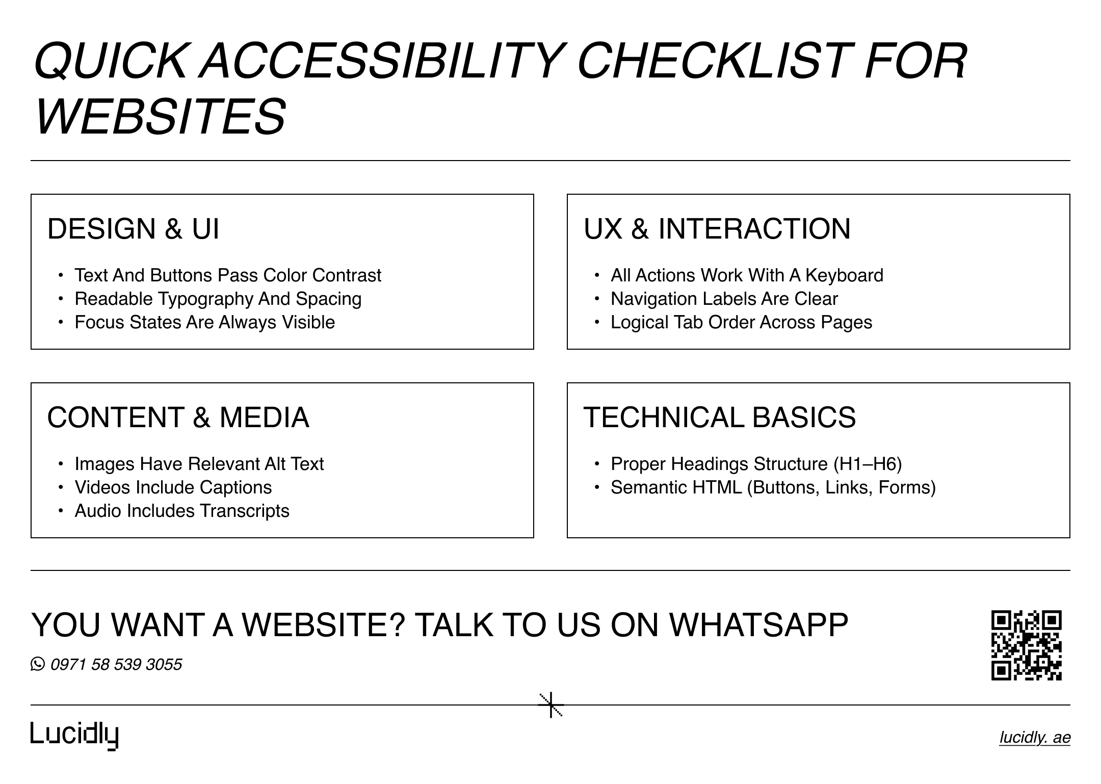
A Practical Accessibility Checklist You Can Reuse
A checklist keeps accessibility from becoming a last-minute scramble. It also helps teams build consistent habits across pages and features.
Use this checklist as a lightweight baseline:
Design: Color contrast, readable typography, visible focus states, large touch targets.
UX: Clear navigation labels, predictable flows, keyboard navigation support.
Content: Descriptive link text, meaningful headings hierarchy, alt attributes where needed.
Forms: Proper labels, helpful error messages, clear instructions, accessible buttons.
Media: Captions for video, transcripts for audio, avoid auto-play surprises.
Tech: Semantic HTML, careful ARIA labels, test with assistive technologies.
This is where accessibility becomes repeatable—and where ux and ui design for websites becomes a system instead of a one-off effort.
Ready to Build a High-Performance Website?
Turn strategy into results with Lucidly’s custom web development solutions — built for speed, SEO, and business growth.
👉 Book Your Web Development Consultation
Common Accessibility Mistakes (Even “Modern” Sites Make)
Accessibility issues often come from design shortcuts that look fine to one user but break for others. If you want a quick “what to avoid” list, start here.
Watch for these patterns:
Icon buttons with no accessible name.
Focus outlines removed for aesthetics.
Placeholder text used instead of labels.
Low-contrast text and disabled states.
Dropdown menus that only work on hover.
Modals that don’t manage focus properly.
Vague links that don’t describe the destination.
These issues are rarely hard to fix—if you catch them early in the design and QA cycle.
FAQ: Quick Answers to Common Questions
How can I make a website accessible for screen readers without redesigning everything?
Start with the foundations: use semantic HTML, add meaningful labels to buttons and form fields, and keep a consistent headings hierarchy (H1–H6). Then run a quick screen reader spot check on key flows (navigation, forms, checkout) and fix any “unlabeled” controls first—those are usually the biggest blockers.
Does web accessibility ruin the look and feel of a modern website?
No. Done well, accessibility often improves design. Strong color contrast, clear typography, and predictable UI patterns make experiences feel more premium and easier to use. In practice, accessibility supports better ux and ui design for websites because it reduces confusion and friction.
What’s the single fastest accessibility improvement I can do today?
Run a keyboard-only test on your most important page. Use Tab and Shift+Tab to move through links, buttons, menus, and forms.
If you can’t reach, see, or activate something, it’s a high-priority fix—especially focus visibility, tab order, and interactive elements that require a mouse.
Accessibility isn’t a separate project. It’s what happens when you design for real humans, not ideal conditions.
When you build responsive web design into your workflow—contrast, focus, labels, semantics, and testing—you create experiences that are clearer, faster to use, and more trustworthy.
If you want your site to be usable for everyone, treat web accessibility basics as part of your ux and ui design for websites standard. Start small, test often, and turn the checklist into a habit. That’s how accessibility becomes sustainable—and how your website becomes truly inclusive.
Contact us — or message Lucidly on WhatsApp for an accessibility + UX review. We’ll identify what’s blocking real users, map the highest-impact fixes, and help you improve usability and compliance without disrupting your site or stack.
References
W3C — Web Content Accessibility Guidelines (WCAG) Overview: https://www.w3.org/WAI/standards-guidelines/wcag/
World Wide Web Consortium (W3C). (w3.org)W3C — Introduction to Web Accessibility: https://www.w3.org/WAI/fundamentals/accessibility-intro/
World Wide Web Consortium (W3C). (w3.org)MDN Web Docs — Accessibility (Web Accessibility): https://developer.mozilla.org/en-US/docs/Web/Accessibility
MDN Web Docs (Mozilla). (developer.mozilla.org)Google Developers — Accessibility (Web Fundamentals): https://developers.google.com/web/fundamentals/accessibility
Google for Developers. (developers.google.com)
