Mobile SEO is no longer optional—it’s the baseline for visibility, trust, and conversions.
With mobile-first indexing, Google primarily evaluates your site through its smartphone experience, so a slow or hard-to-use page can hold back rankings across the board.
In this guide, you’ll learn mobile-friendly SEO essentials, responsive design SEO fixes, and mobile SEO best practices that improve mobile usability, page speed on mobile, and overall mobile user experience. Let’s turn your mobile-friendly website into a growth engine.
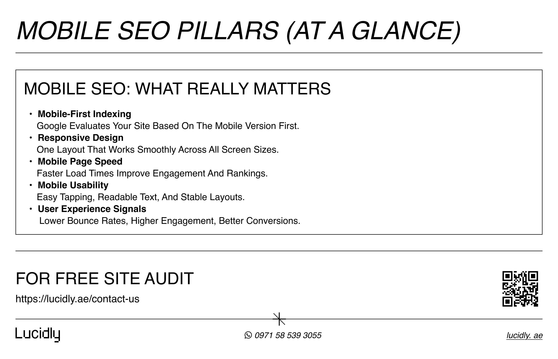
Mobile-First Indexing: What It Changes for SEO
With mobile-first indexing, Google primarily uses the smartphone version of your pages for indexing and ranking.
If your mobile layout hides key content, removes structured data, or blocks CSS and JavaScript, your visibility can drop—even when the desktop version looks perfect.
That’s why mobile SEO today is not about shrinking a layout, but about ensuring content parity, clean rendering, and a genuinely mobile-friendly website that delivers strong mobile usability and mobile user experience.
Page Speed on Mobile: The Performance Signals That Matter
According to Google Search Central, Core Web Vitals are part of Google’s page experience signals and help differentiate between pages with similar relevance and content quality.
On mobile devices, slow loading times, delayed interaction, or unstable layouts can significantly weaken user engagement and search performance.
Improving page speed on mobile is therefore not just a technical task, but a core part of mobile SEO best practices that directly supports better rankings and conversions.
Mobile-Friendly SEO Starts With Responsive Design
A strong mobile-friendly SEO foundation starts with responsive design SEO—not because it’s trendy, but because it creates one consistent experience across screen sizes without splitting content or signals.
Done right, responsive design makes it easier to maintain your pages, keep layouts stable, and protect content parity between mobile and desktop.
For mobile SEO, the goal isn’t a “smaller website”—it’s a mobile-friendly website built for real users.
Start by checking these essentials:
Use readable typography with comfortable line spacing.
Make buttons and links touch-friendly (easy to tap, not cramped).
Keep layouts stable (avoid elements jumping while loading).
Prevent horizontal scrolling on common smartphone widths.
Ensure key content and navigation are visible and easy to access.
Want help implementing this checklist across your key pages? request on-page support from our Professional SEO firm.
Page Speed on Mobile: The Ranking + Revenue Multiplier
On mobile, speed is the difference between a click and a bounce.
If a page loads slowly, responds late, or shifts while reading, users leave—so page speed on mobile becomes a key pillar of mobile SEO, influencing trust, engagement, and conversions.
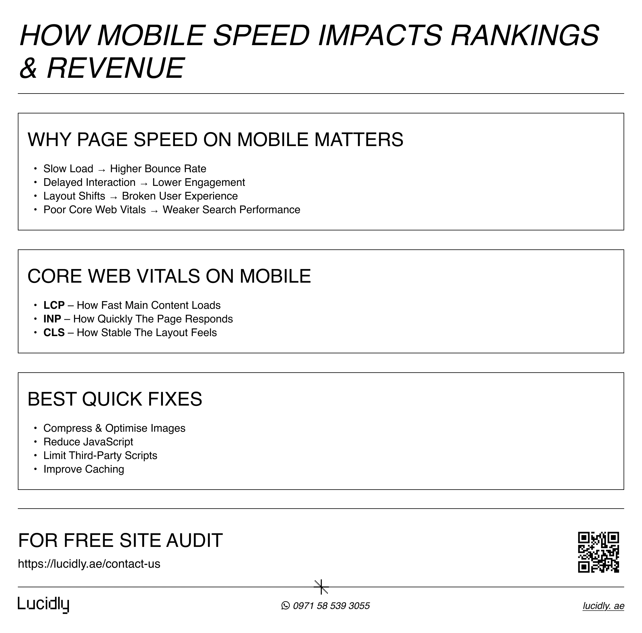
Why Mobile Speed Matters More Than Ever
According to Google Search Central, page experience signals—including Core Web Vitals—are used to help differentiate between pages with similar relevance and content quality.
On mobile devices, even small delays in loading or interaction can break the experience and push users away.
That’s why improving page speed on mobile is a core part of modern mobile SEO, directly influencing engagement, trust, and conversion rates.
Core Web Vitals on Mobile (What to Focus On)
On mobile, Core Web Vitals focus on how quickly main content appears, how fast the page responds to user input, and how stable the layout feels while loading.
Poor scores often point to heavy images, excessive JavaScript, or unstable design elements. Addressing these issues improves not only performance metrics, but also the overall mobile user experience that search engines aim to reward.
Quick Wins to Improve Page Speed on Mobile
The good news is that most mobile speed problems come from a small set of repeatable issues—heavy images, too much JavaScript, and unnecessary third-party scripts. Start with these high-impact fixes first, because they typically deliver the fastest gains with the least effort:
Compress and resize images (serve modern formats where possible).
Defer non-critical JavaScript and remove unused scripts.
Reduce third-party tags (chat widgets, trackers) and load only what you need.
Optimise fonts (limit variants, preload only when justified).
Improve caching and consider a CDN for global visitors.
Technical Mobile SEO: Foundations You Can’t Ignore
Even with great design and fast load times, mobile SEO can fall short if the technical seo foundations aren’t solid.
Search engines need to crawl, render, and understand your mobile pages exactly as users see them.
When technical issues block that process, rankings and visibility suffer—often without obvious warning signs.
Crawling and Rendering on Mobile
For mobile pages to rank, Google must be able to access and render all critical resources. Blocking CSS or JavaScript files can prevent search engines from seeing responsive layouts or interactive elements correctly.
This can lead to misinterpreted layouts, hidden content, or inaccurate usability signals.
Content Parity Between Mobile and Desktop
One of the most common technical seo mistakes is stripping content from mobile pages to “simplify” the layout.
With mobile-first indexing, missing headings, text, internal links, or structured data on mobile can weaken relevance signals.
The goal is not identical layouts—but equivalent content and intent.
learn more about content with our on-page seo guide.
Structured Data and Metadata on Mobile
Structured data should be present and valid on mobile pages just as it is on desktop. Inconsistent schema markup or missing metadata can reduce eligibility for rich results and affect how pages appear in search.
Keeping structured data consistent helps reinforce clarity and trust signals.
Internal Linking on Mobile
Internal links on mobile must be easy to find and easy to tap. Links buried in collapsed menus or placed too close together can reduce crawl efficiency and user engagement. Clear, accessible internal linking supports both navigation and mobile search optimisation.
FAQ
What is mobile SEO?
Mobile SEO is the process of optimising a website so it performs well on smartphones, focusing on mobile usability, page speed, responsive design, and mobile-first indexing.
What is mobile-first indexing?
Mobile-first indexing means Google primarily uses the mobile version of a website’s content for indexing and ranking instead of the desktop version.
How do I know if my site is mobile friendly?
You can check mobile friendliness by reviewing usability and performance reports in Google Search Console and by testing how your pages behave on real mobile devices.
Does mobile SEO affect desktop rankings?
Yes. Because Google relies on the mobile version of content for indexing, weaknesses in mobile SEO can impact overall visibility, including desktop search results.
Mobile is no longer just another device—it’s the standard by which websites are judged. From mobile-first indexing to page speed and usability, every part of mobile SEO directly shapes visibility, trust, and conversions.
A mobile-friendly website that loads fast, displays content clearly, and supports real user intent is no longer a competitive advantage—it’s the minimum requirement.
If your mobile experience falls short, rankings and revenue will follow.
Contact us for a mobile performance audit—message us on WhatsApp and we’ll pinpoint what’s slowing your site down on smartphones (speed, usability, and Core Web Vitals).
References
Google Search Central — Mobile-First Indexing
web.dev — Core Web Vitals
